Optimizing Trade Experience
The Merrill Edge app enables users to manage investments, trade stocks, ETFs, mutual funds, and options, and seamlessly access linked Bank of America accounts in one place.
Partnering with stakeholders and business owners, our team focused on increasing adoption of the trading experience. Recent research revealed low engagement among users, prompting us to investigate key barriers preventing broader usage.
Overview
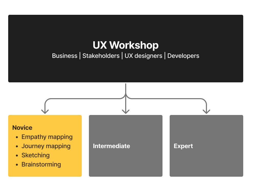
To improve the trading experience within the Merrill Edge app, stakeholders, UX designers, and developers collaborated in a workshop to reimagine the end-to-end trade flow.
Participants ranged from experienced traders to first-time investors, helping us identify shared motivations and friction points. From this, we defined three core segments: Novice, Intermediate, and Advanced traders—each requiring different levels of guidance and control.
My focus centered on the Novice persona, “Andy,” designing an experience that builds clarity, trust, and confidence for first-time traders.
My Role
Iterative Design & Alignment
Participated in daily working sessions led by the UX Lead to align on direction, priorities, and next steps. Iteratively refined design solutions based on team feedback and evolving requirements.Partnered closely with the Copy Strategist to ensure messaging aligned with business objectives, financial terminology standards, and clarity for users.
Cross-Functional Collaboration
Presented progress at the end of each week to business owners and stakeholders, gathering feedback to inform refinements and define priorities for the following sprint. Ensured design decisions balanced user needs with business goals.
First-Time Trade Flow: Andy
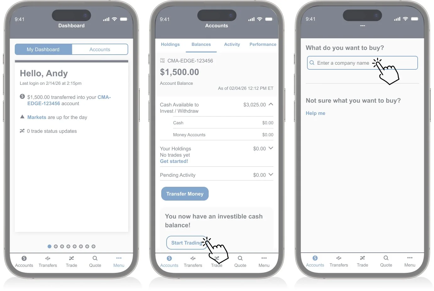
Andy is excited to place his first trade after a friend recommends investing in AAPL. He recently earned extra income selling vintage items on eBay and transferred those funds into his trading account.
Before moving forward, Andy checks his account balance to confirm the funds are available. Although motivated, he feels a level of hesitation—he wants reassurance that he understands what he’s doing before committing his money.
This moment represents a critical UX opportunity:
Build trust at a high-stakes decision point
Reduce anxiety through clarity and guidance
Reinforce confidence before execution
“Designing for Andy means understanding that a first trade is both exciting and intimidating. The experience should balance momentum with education—guiding action without overwhelming the user.”
User flow
Task 1 - Just-In-Time Guidance
Challenge
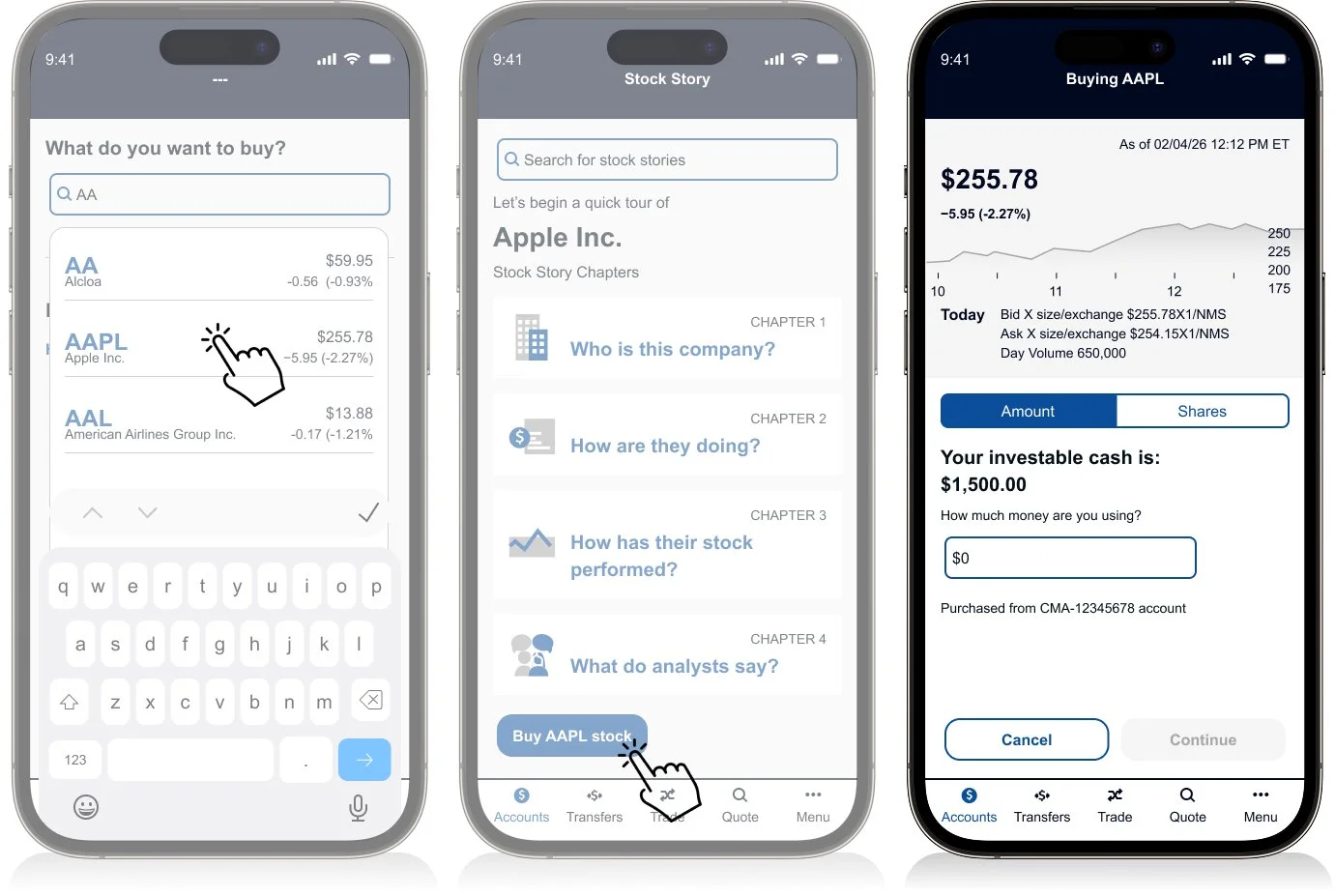
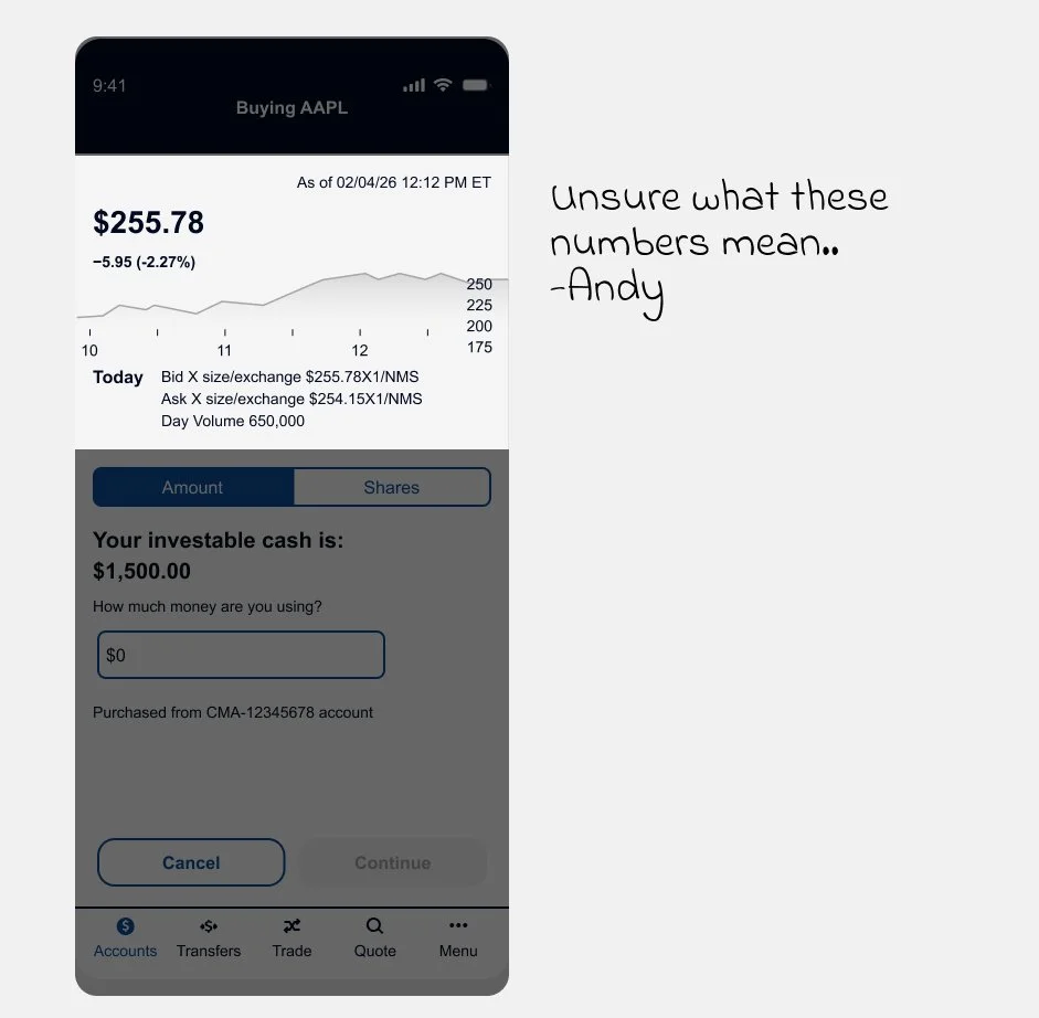
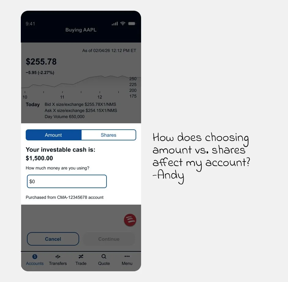
Andy selects AAPL and enters his purchase amount. He notices unfamiliar numbers beneath the stock price ($255.78) and the label “Bid × size/exchange,” which immediately creates uncertainty.
At this critical moment, unclear terminology shifts him from confident to hesitant.
How might we clarify complex trading data in a way that reassures first-time users—without disrupting the purchase flow?
Solution
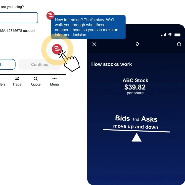
To support first-time traders without disrupting experienced users, I positioned the Erica CTA in the lower-right corner—visible, but non-intrusive.
Tapping it launches Erica, delivering immediate, in-context guidance without interrupting the trade flow. Erica provides clear explanations and reassurance before users proceed.
This approach:
Reduces cognitive overload
Builds trust through guided education
Preserves workflow continuity
Reinforces confidence during a first trade
By keeping support optional and accessible, the experience prioritizes clarity and reassurance at a critical decision point.
Explore the full interaction—including supporting micro-animations
Task 2 - Buying by Amount vs. Shares
Challenge
Users can buy by dollar amount or number of shares—but would a novice like Andy understand the difference or how it impacts his account?
The current segmented toggle (“Amount” / “Shares”) is functionally clear, yet adds visual weight and friction at a sensitive decision point.
How might we simplify the UI and clarify the distinction—while making the experience more intuitive for first-time traders?
Solution 1 of 2:
Slide-Up Calculation Tool
I introduced a real-time slide-up calculator that makes the relationship between total investment, estimated shares, and current price immediately clear.
The interactive slider provides instant feedback and improves transparency—helping novices understand what changes when switching between amount and shares. However, testing feedback showed the modal-style interaction felt disruptive to the trade flow.
Explore the interaction (including the interactive slider)
Solution 2 of 2:
Embedded Slider Within the Calculator
To preserve momentum, I integrated the real-time slider directly into the calculator section of the trade form.
This maintained transparency while making the interaction feel native to the UI. Users can adjust inputs and instantly see the breakdown—without leaving the purchase moment.
The result: a cleaner, more intuitive experience that supports understanding without interrupting execution.
Explore the interaction (including the embedded slider)
Task 3 - Interactive Trade Guidance
Challenge
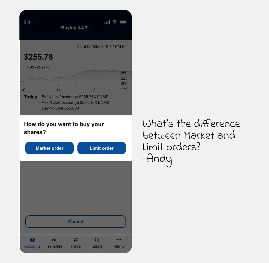
After entering his trade amount, Andy must choose between a Market or Limit order.
For experienced traders, this is routine. For first-time users, it introduces uncertainty at a high-stakes moment.
How might we explain the difference clearly—without cluttering the interface or slowing the trade flow?
Solution
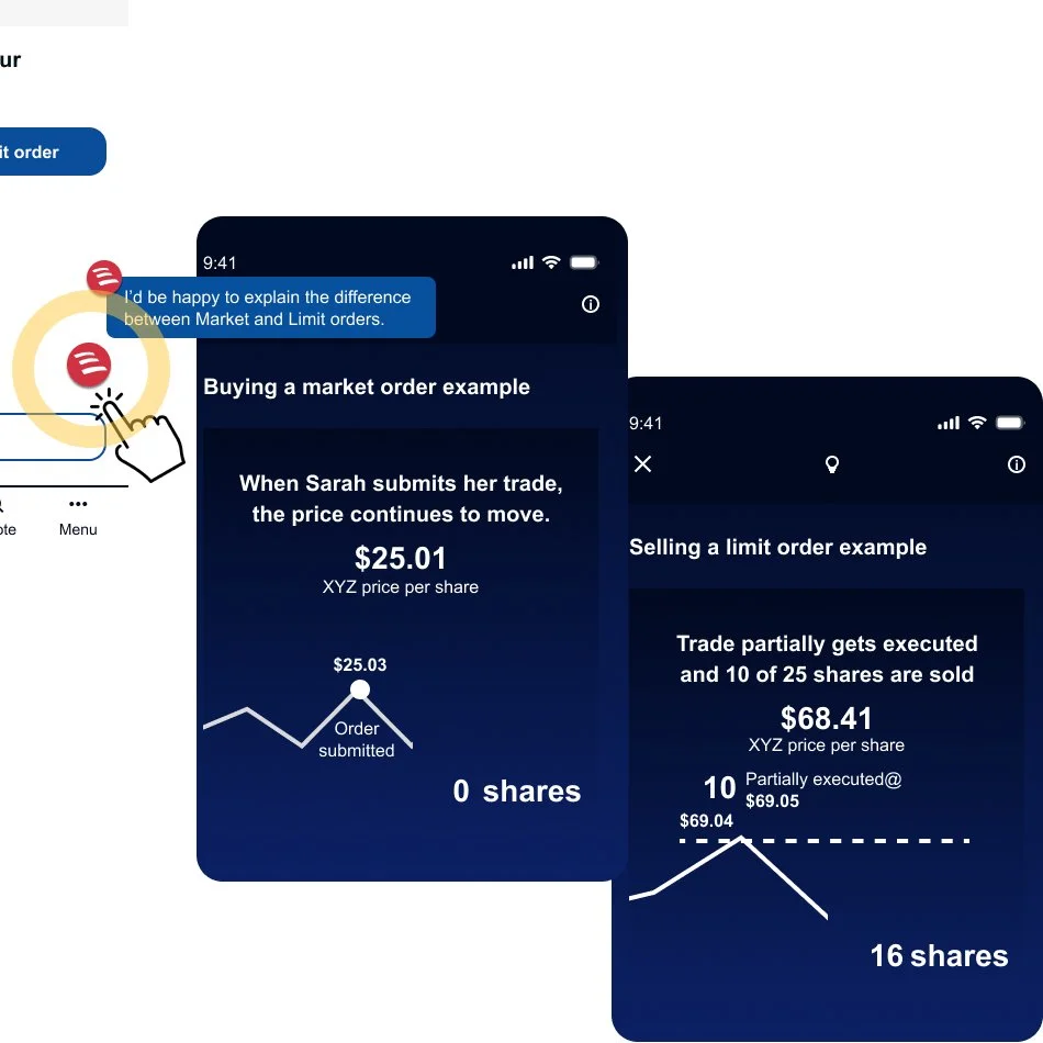
To support beginners while preserving efficiency for advanced users, I maintained a subtle Erica CTA that launches Erica on demand.
This approach:
Keeps the trade flow clean
Delivers contextual education only when needed
Preserves autonomy for experienced investors
Builds confidence for first-time traders
Within Erica, users can view two short example animations: one demonstrating a Market order purchase and another illustrating a Limit order sale.
These real-world scenarios help Andy relate to the concepts, clearly understand the differences, and proceed with greater confidence.
Explore the full interaction—including supporting micro-animations
Test Results
We conducted usability testing across participants with advanced, limited, and no investment experience.
Feedback on the help features:
Users responded positively to on-demand guidance
Contextual explanations increased clarity
Participants noted that the support “instilled trust” in the experience
The optional assistance modal proved effective—supporting novice users without disrupting experienced traders.
Conclusion
Based on testing insights, we refined the interaction patterns and visual treatments to improve clarity and alignment.
Final designs were then prepared for developer handoff, including updated flows, interaction specifications, and refined UI components to support implementation.

