
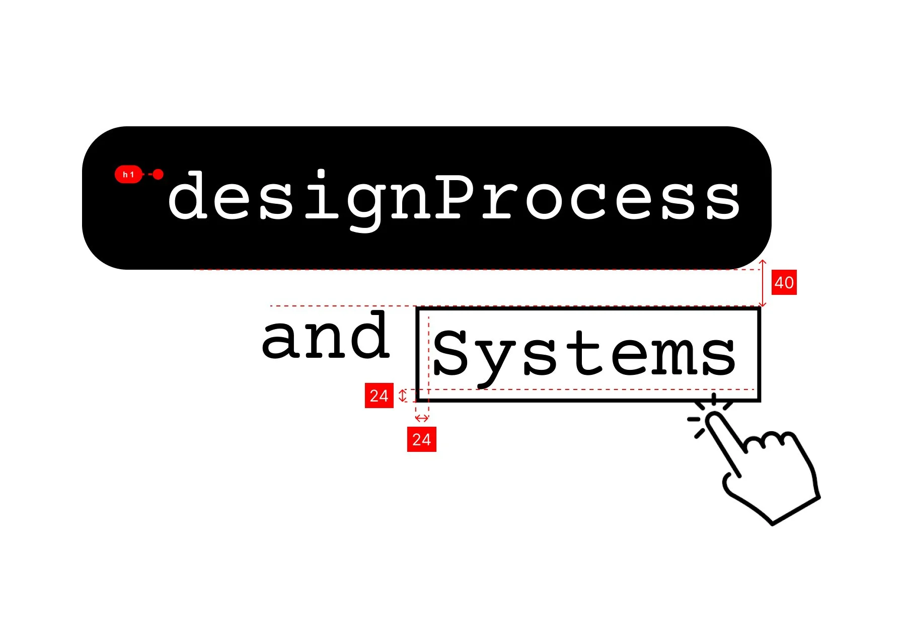
Design Process & Systems
A snapshot of how I design at scale. From leveraging design systems and shared libraries to ensure consistency, to delivering developer-ready specs with clear annotations (including A11Y). I also bring ideas to life through branding, turning concepts into polished, final designs.
Design System Consistency at Scale
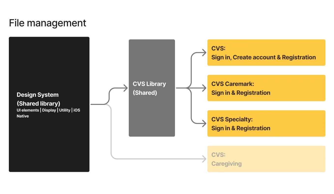
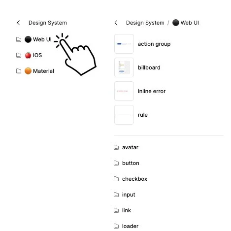
I structured a centralized Figma shared library to manage design assets across multiple products and teams. This approach ensures that core UI components and patterns are created once and reused consistently across experiences.
By connecting shared libraries to CVS Health, Caremark, and CVS Specialty flows, I enabled teams to work from a single source of truth—streamlining updates, improving consistency, and reducing duplication across files.
Design Systems & Delivery
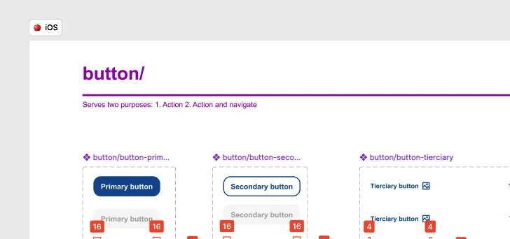
I design at scale by leveraging structured design systems and shared libraries. I build reusable components across Web, iOS, and Material, simplifying complex variations into intuitive controls like toggles and dropdowns. Making them easy for teams to use and scale.
These components are built for development, aligning with Angular, React, and Next.js. Each includes all interaction states (default, hover, pressed, disabled), ensuring consistency and production-ready implementation.
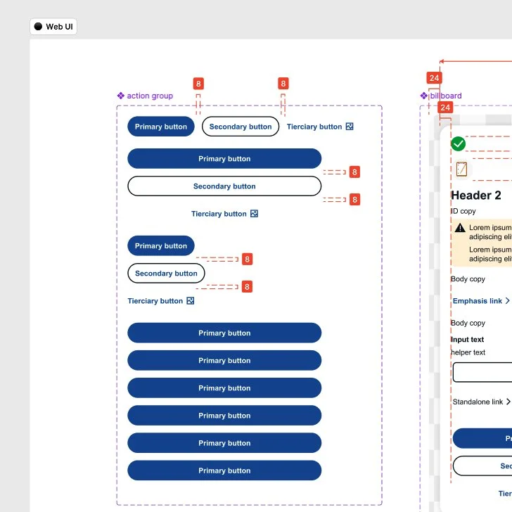
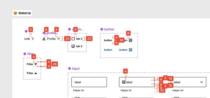
Structure & Naming
I organize libraries with clear naming conventions and logical grouping. Nested components and consistent structure make it easy for designers to quickly find, drag, and apply the right elements. Reducing friction and improving speed.
Developer Handoff
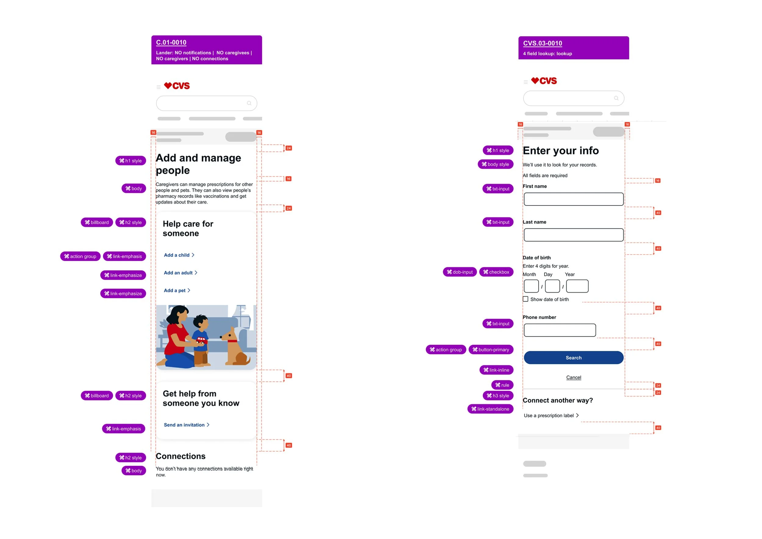
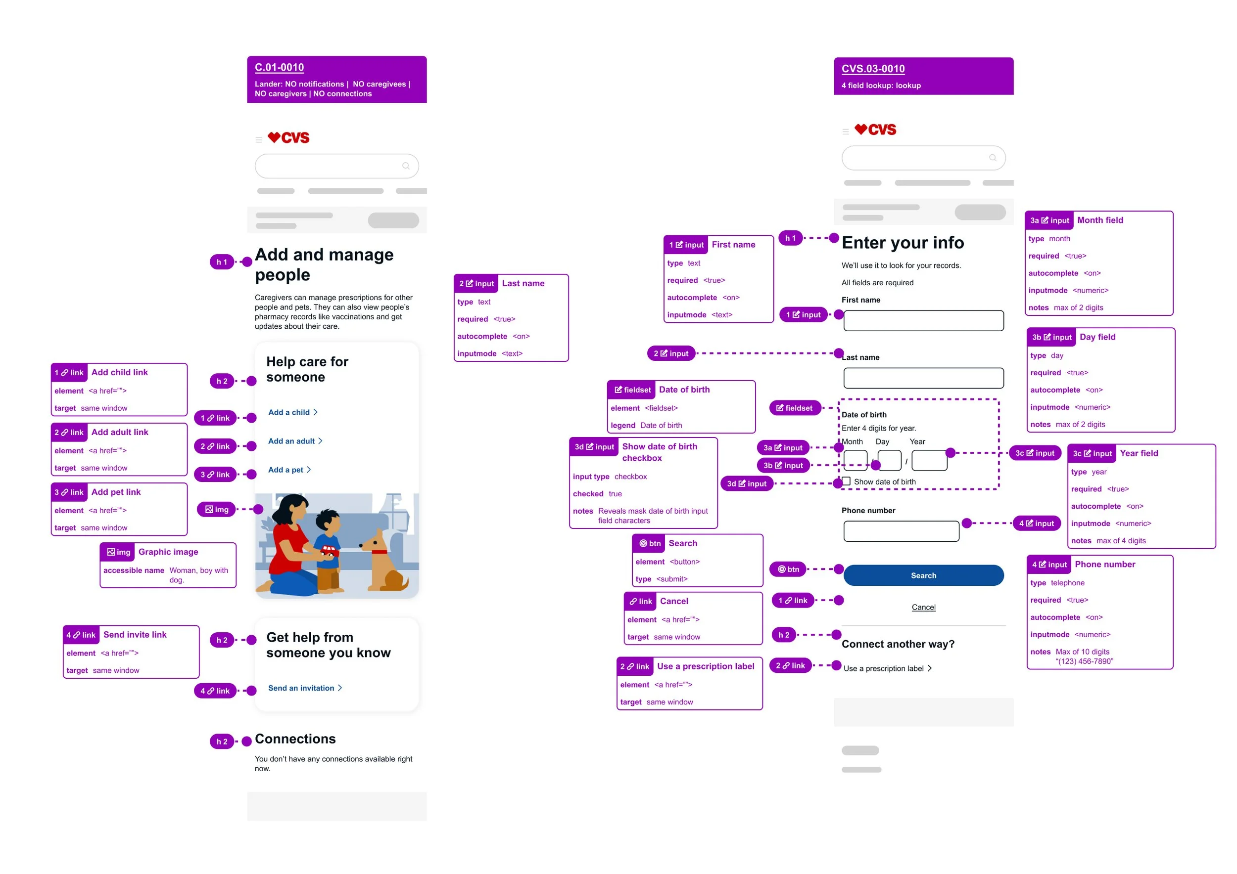
I deliver clean, developer-ready handoffs with clarity and precision. Every detail is documented to reduce ambiguity, align teams, and ensure accurate implementation.
Design annotations
Specify UI components, patterns, and spacing using the design system
A11Y annotations
Define roles and behaviors (buttons, links, inputs), required fields, keyboard types, semantic structure (e.g., H1), and accessible naming for images
Error Management
I created a centralized error catalog for input-related states to drive consistency across products and teams. Maintained as a shared Figma library, it aligns teams on standardized labels, descriptions, actions, and associated input fields.
This system reduces ambiguity, improves accountability, and minimizes developer confusion across CVS Health.
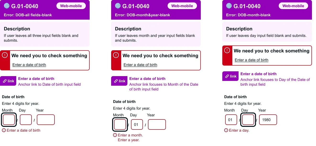
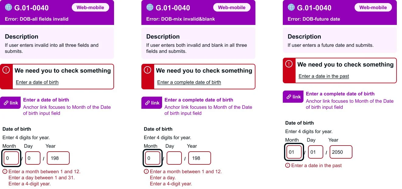
“I’m happy to walk through how I approach error handling, from detailed flows and annotations to managing complex edge cases through a standardized global error library.”
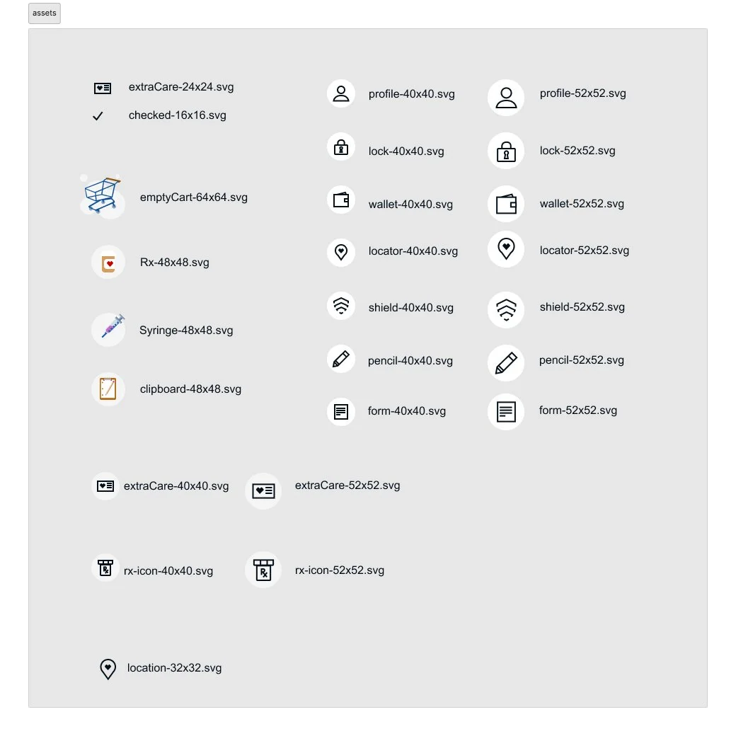
Assets
I provide all necessary assets in the correct formats and ensure they follow established naming conventions for clear developer handoff and organization. For web integrations, vector assets are delivered as SVGs to preserve visual quality while maintaining optimized file sizes and performance.
Visual Design
Logos
From the pharmaceutical industry to small businesses, I create refined logo designs through thoughtful exploration and iteration. Each concept evolves through multiple rounds of refinement—balancing brand identity, visual clarity, and scalability to arrive at a polished final mark.
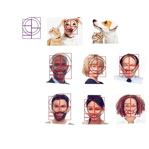
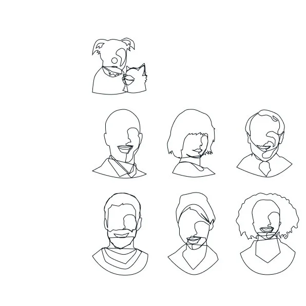
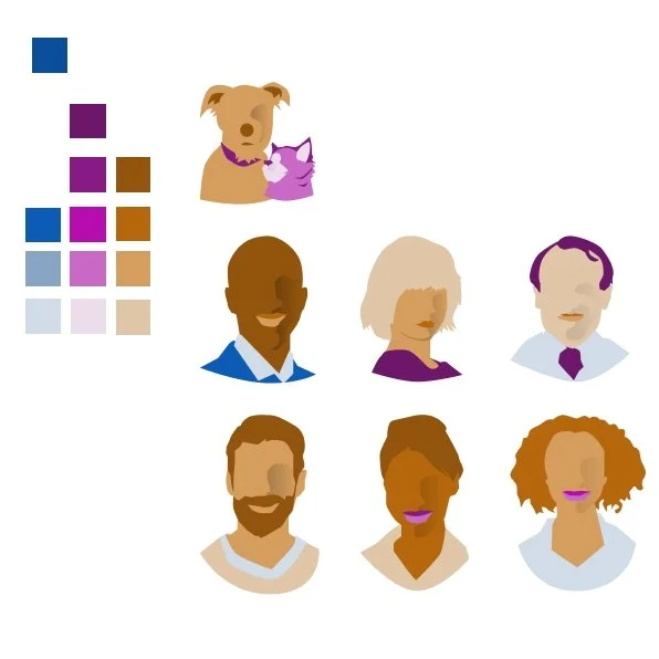
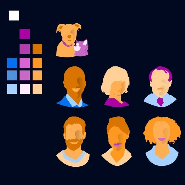
Illustrations
I create abstract illustrated portraits that capture culture, expression, and personality without becoming overly specific. Using the Fibonacci sequence as a proportional guide, I build faces that feel balanced while still allowing room for stylized interpretation.
This section shows my step-by-step process—from mapping the original photo with Fibonacci-based proportions, to outlining the illustration, to applying a color palette that works across both light and dark modes.