
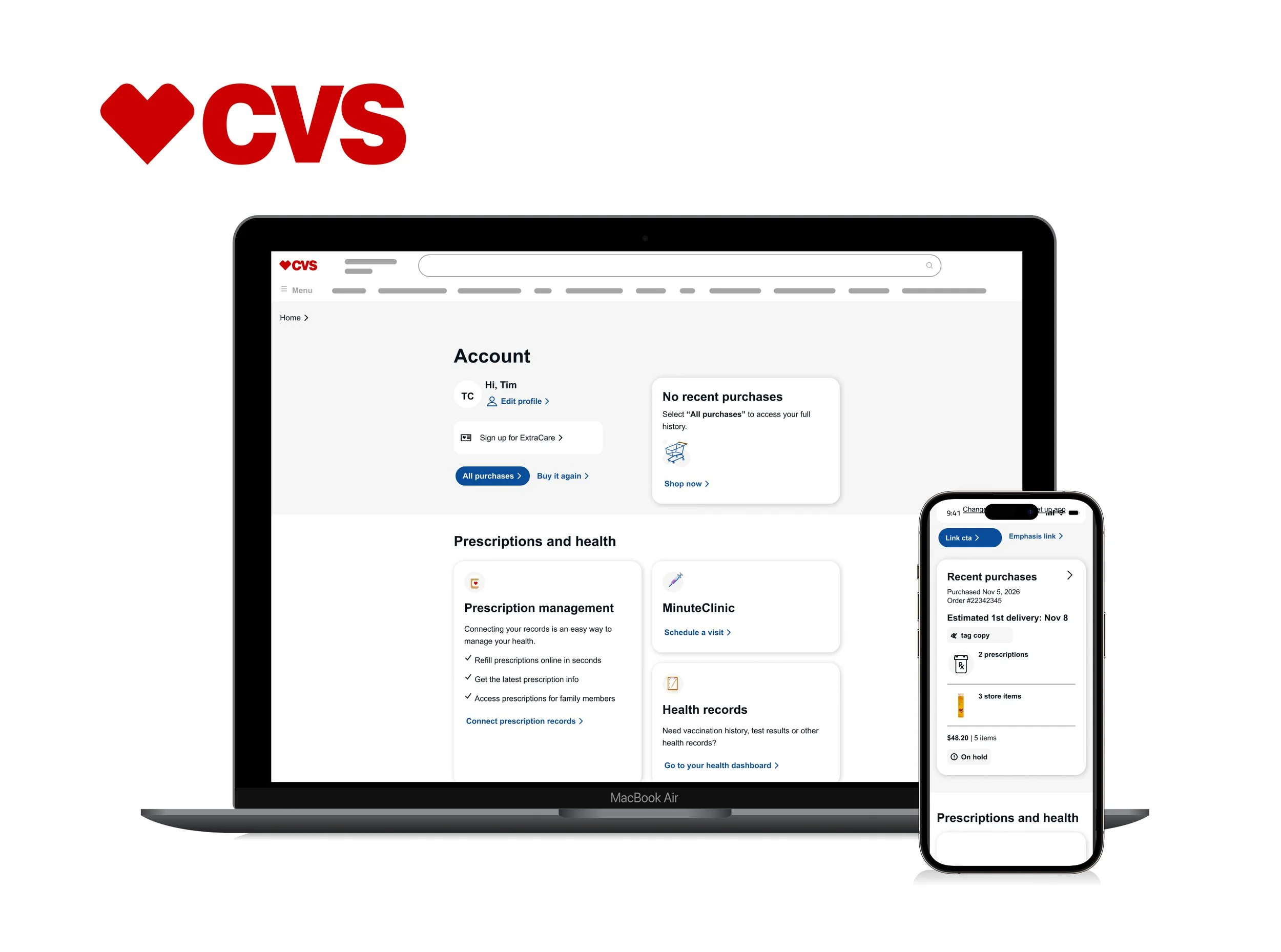
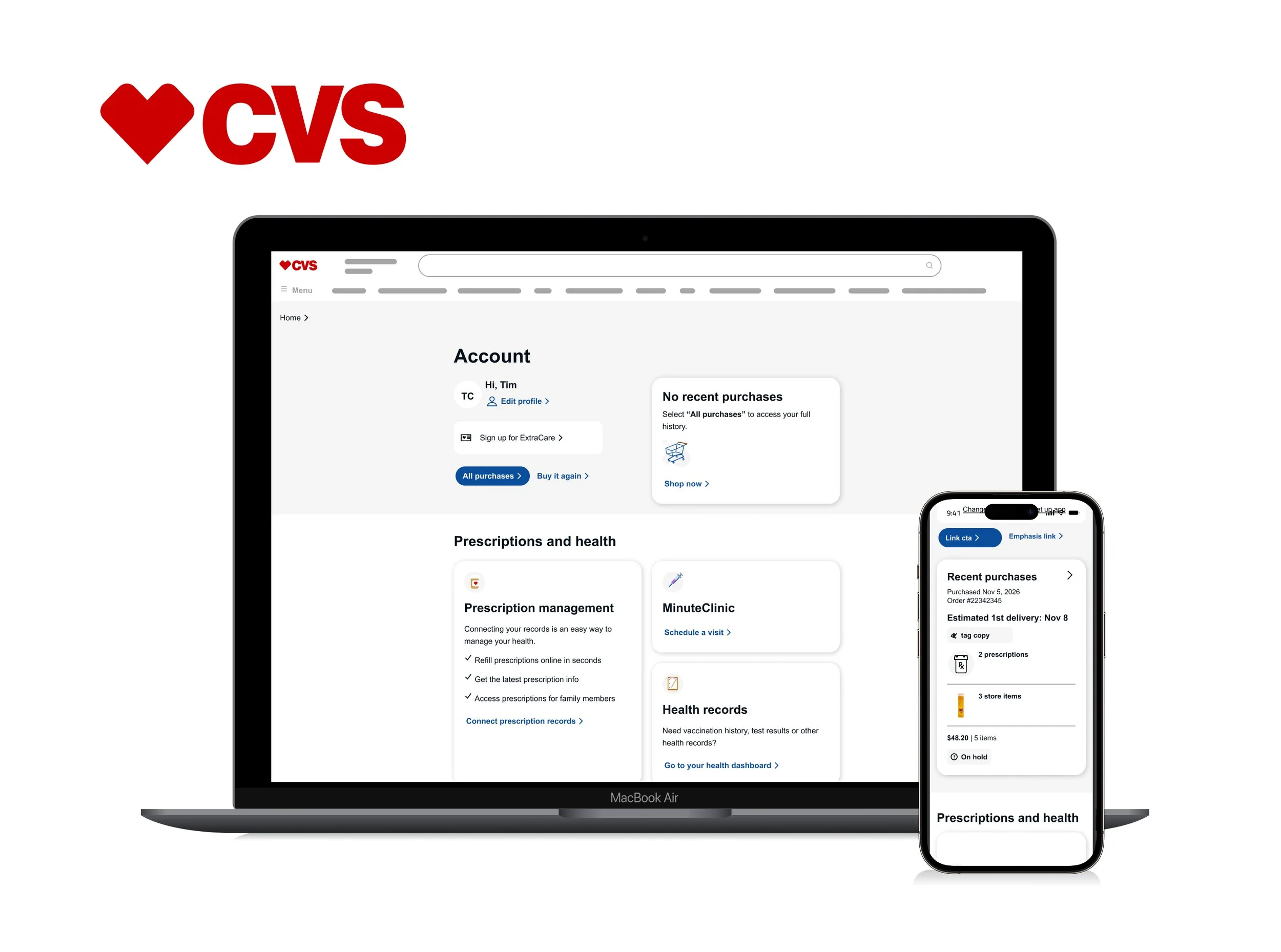
CVS Health - Account Dashboard
Simplifying Navigation.
Improving Accessibility.
Scaling the Experience.
CVS Health Account Dashboard — before and after
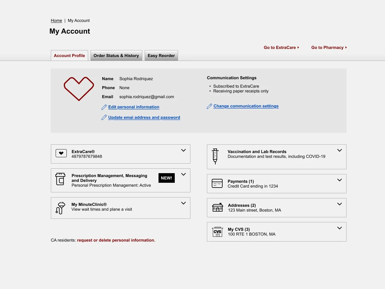
Challenge
The original flow introduced unnecessary complexity. Too many fields, unnecessary information, and inconsistent experiences increased friction and made errors more likely.
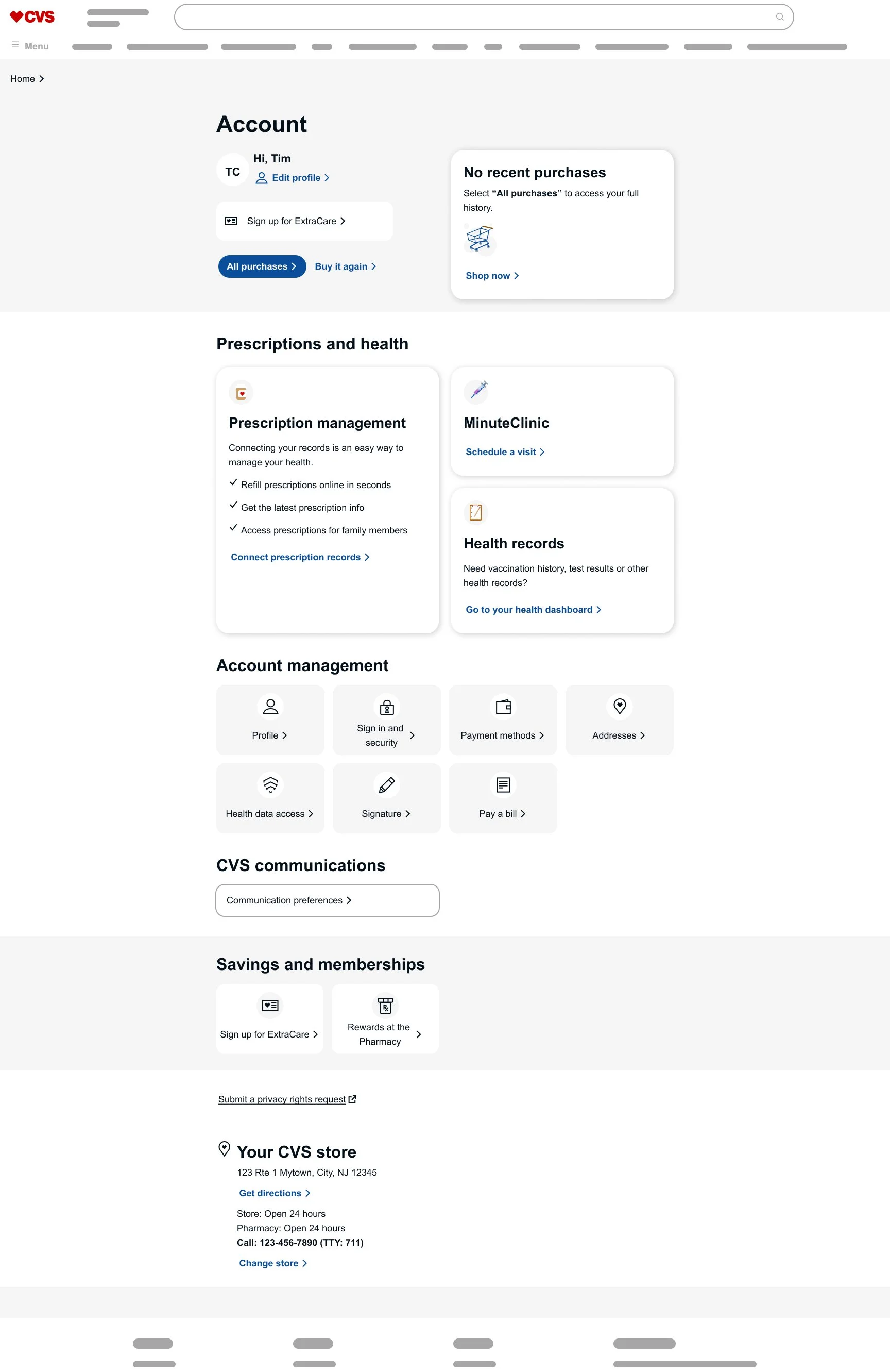
Solution
I simplified the information architecture, modernized the visual design, improved accessibility, and created a scalable dashboard that adapts to each user's needs.
Developer Handoff
I create developer-ready handoffs that reduce ambiguity and help teams build with confidence.
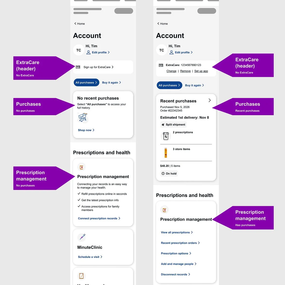
Responsive direction
I documented responsive layouts and interactions, helping engineering implement consistent experiences across devices.
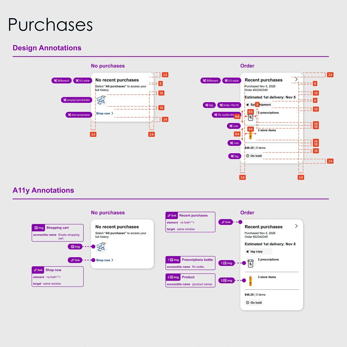
Design and accessibility annotations
I document design and accessibility requirements so engineering can build accurately and consistently.
Design Exploration
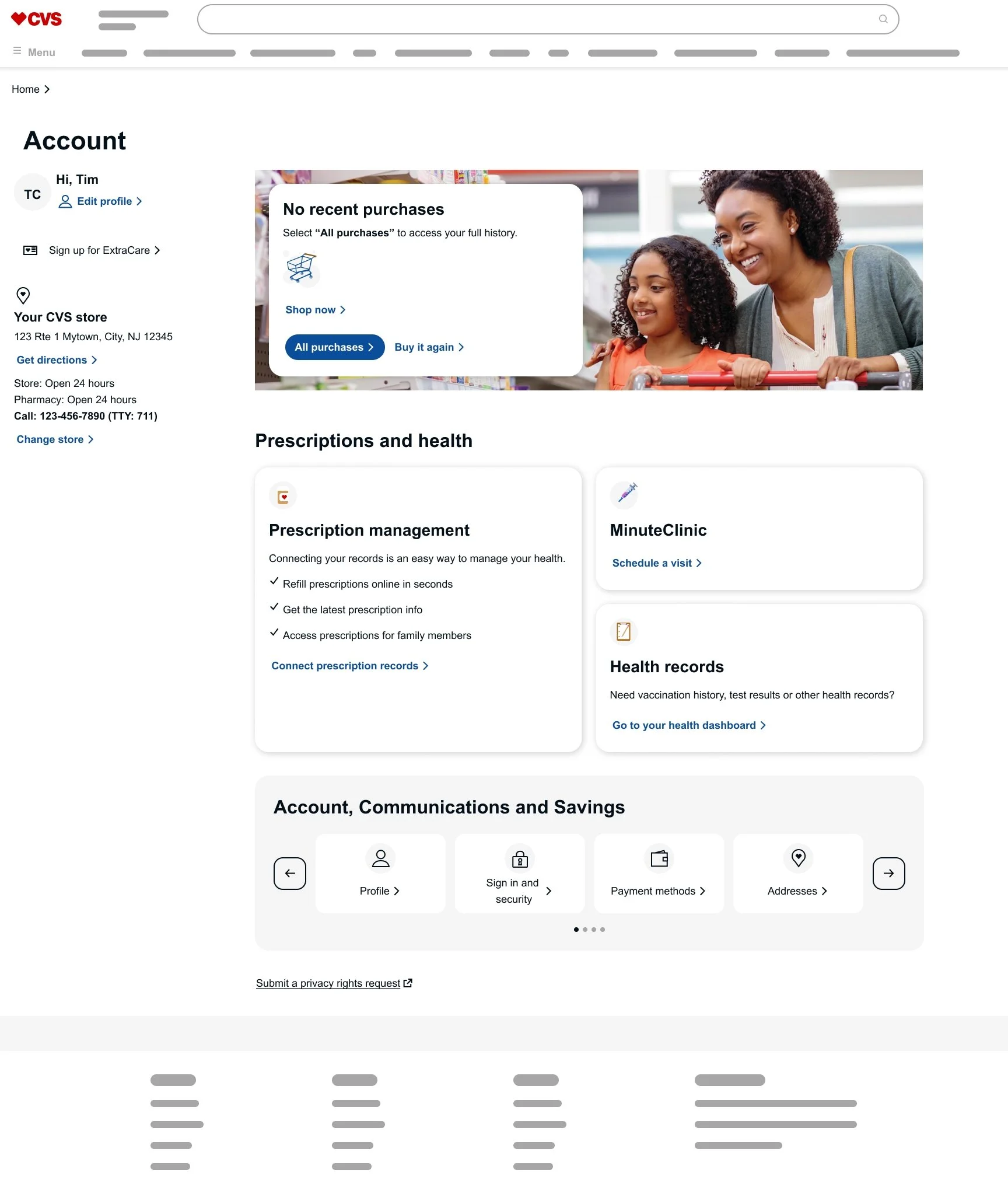
I explored multiple directions before landing on the final design. Each concept helped evaluate information architecture, accessibility, and visual hierarchy to ensure the dashboard stayed focused on helping users complete their tasks.
Then, instead of paragraphs, use three short callouts next to the concept.
Marketing over utility — Promotional imagery distracted from account tasks.
Hidden actions — Carousels reduced discoverability and accessibility.
Broad categories — Generalized groupings made navigation less intuitive.
Quisque iaculis facilisis lacinia. Mauris euismod pellentesque tellus sit amet mollis.