CVS Health - Caregiving
Caregiving connects people and pets (“caregivees”) to a single account. Users can oversee multiple recipients, manage their own prescriptions, or invite caregivers to assist with medication management—all within a unified experience. This approach modernizes caregiving while enabling connections across people, records, and lines of business throughout the enterprise.
Overview
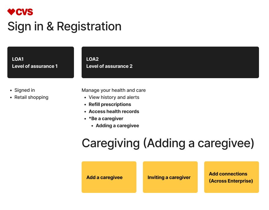
At LOA2 (Level of Assurance 2) authentication, CVS Health users unlock access to caregiver functionality, prescription refills, and health records. My focus was designing the flow to add a care recipient—ensuring lookup, consent, account relationships, enterprise access, and account linking were clear, secure, and easy to complete.
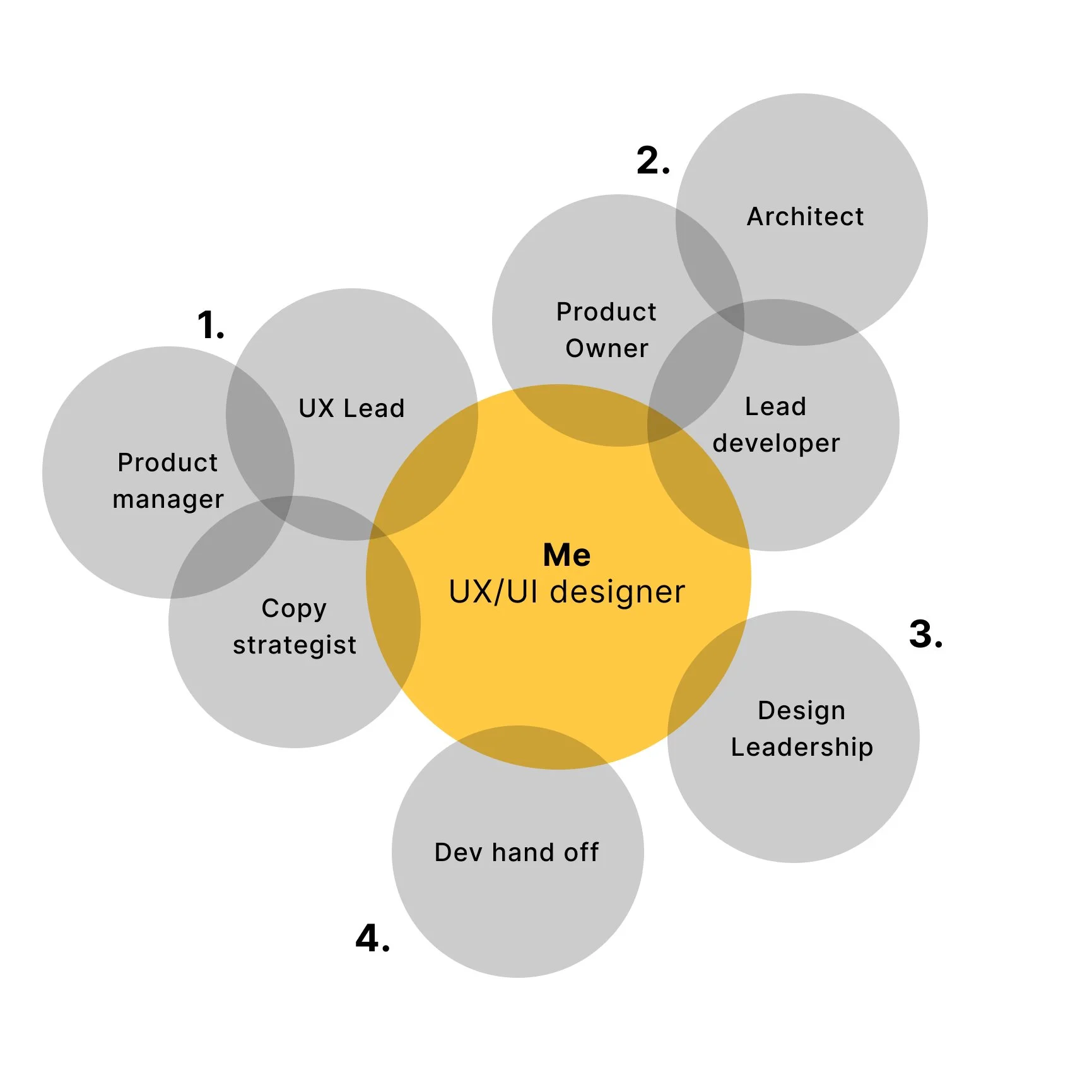
My role
Identify opportunities
I reviewed metrics-driven recommendations from the product manager and partnered with the UX Lead and copy strategist to assess proposed changes within the flow, raising early technical and usability questions.Validate feasibility
I collaborated with the product owner, architect, and lead developer to resolve open questions, align on technical constraints, and confirm feasibility.Present design solutions
I explored and mocked up multiple design concepts, aligning them with current branding and accessibility guidelines through ongoing collaboration with the UI kit team. I presented recommendations to design leadership and cross-functional stakeholders for review and alignment.Finalize and hand off
I refined approved screens and delivered developer-ready Figma files, including detailed annotations, accessibility considerations, user flows, and assets to support implementation.
Landing page — before and after
Original lander
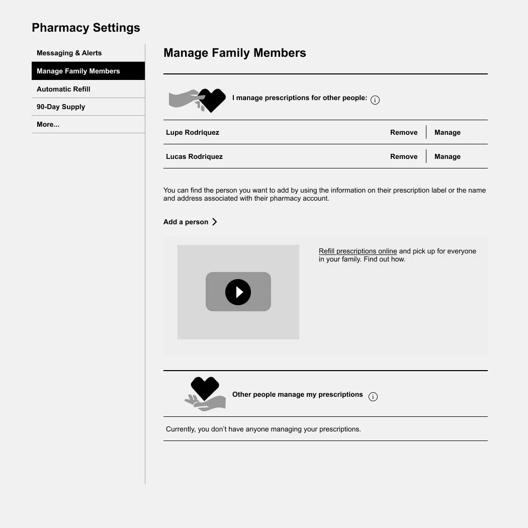
Why the original design was challenging for users
Unclear content hierarchy — messaging was scattered and did not clearly communicate the page’s primary purpose.
Low-value navigation — the side menu provided limited utility, with metrics showing minimal user engagement.
Limited scalability — caregiver details were not designed to scale, and additional features risked cluttering the interface.
Ineffective instructional copy — phrasing such as “I manage prescriptions for other people” required user interpretation rather than guiding action.
Accessibility concerns — actions like “Manage” and “Remove” were visually separated from associated names, making it challenging for users that are zooming in.
Broken media experience — the embedded video failed to load or function as intended.
Improved lander
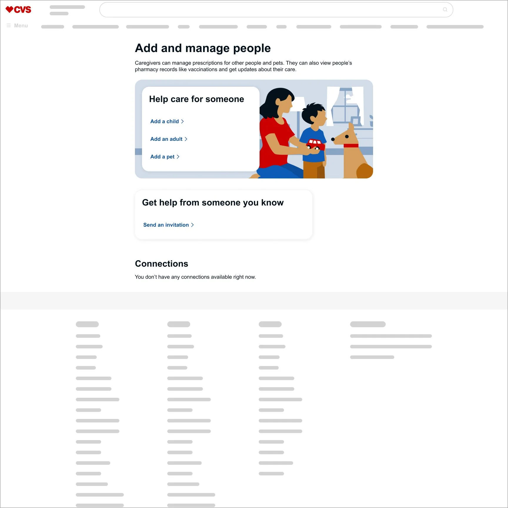
Why the improved design works for users
Delivered clear, unified messaging — consolidated copy and introduced explicit action steps to reduce confusion.
Reduced distraction — removed the side menu and video to keep users focused on primary tasks.
Improved scalability — moved caregiver details to a dedicated page, allowing the experience to grow without clutter.
Designed a future-ready layout — structured the landing page to support new sections, such as Connections, without compromising clarity.
Strengthened accessibility — placed actions directly alongside related content to improve usability for screen readers and all users.
From 240 to 500 daily active users—driven by clearer flows, lower friction, and a more intuitive experience.
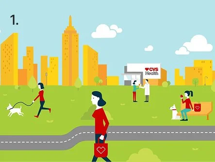
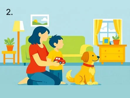
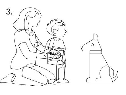
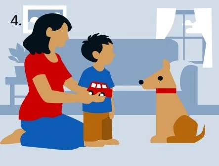
Four-step illustration process using AI
Reference the CVS Health style guide
I used an existing illustration from the CVS Health style guide to guide the AI prompt and ensure stylistic consistency.Generate the base illustration
I generated an initial image using AI based on the reference style.Structure the illustration for potential animation
I rebuilt the AI output with layered vector shapes so elements could overlap and move independently if subtle animation is later introduced.Finalize the illustration
I applied the correct variable color sets, refined the composition, and staged the final image for use in the experience.
Look up — before and after
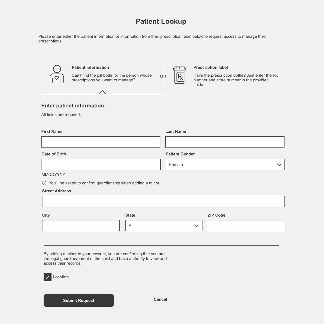
Original look up
Why the original design was challenging for users
Excessive input fields — the volume of fields increased cognitive load and raised the likelihood of user error.
Unnecessary data exposure — some information shown was not required for task completion.
Inconsistent experiences across devices — behavior and layout differed between mobile and desktop views.
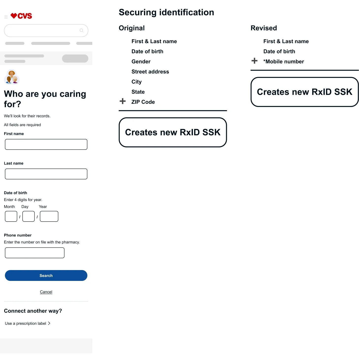
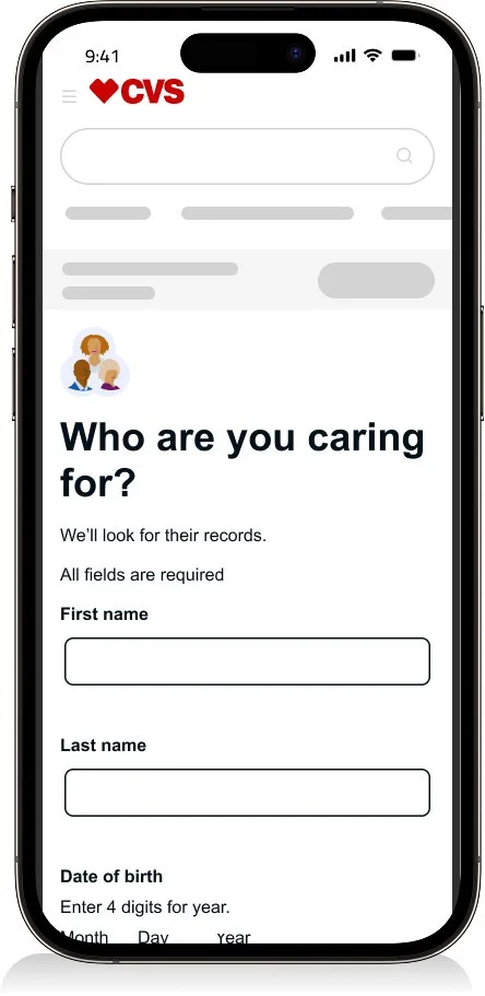
Improved look up
Why the improved design works for users
Reduced cognitive load — simplified input fields from eight to four, using only essential information (first and last name, date of birth, and mobile number) to support secure identification.
Ensured a consistent cross-platform experience — aligned layouts and behaviors across desktop and mobile views.
From 40% to 93% user success—driven by a simpler, clearer lookup experience.
“I’d be glad to walk through more of this work—especially the Healthy Caregiver features, enterprise-wide connections across CVS Health, and caregiver invitations.”
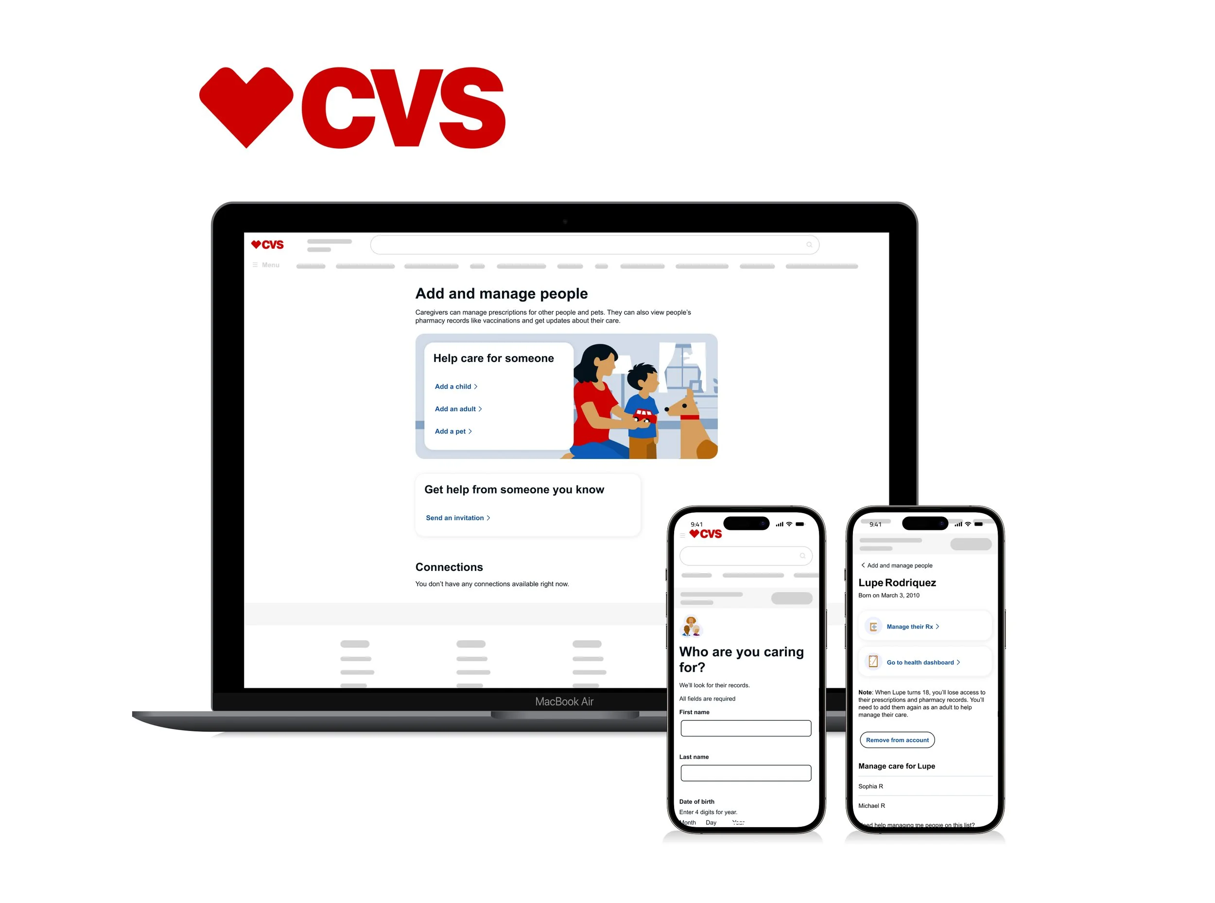
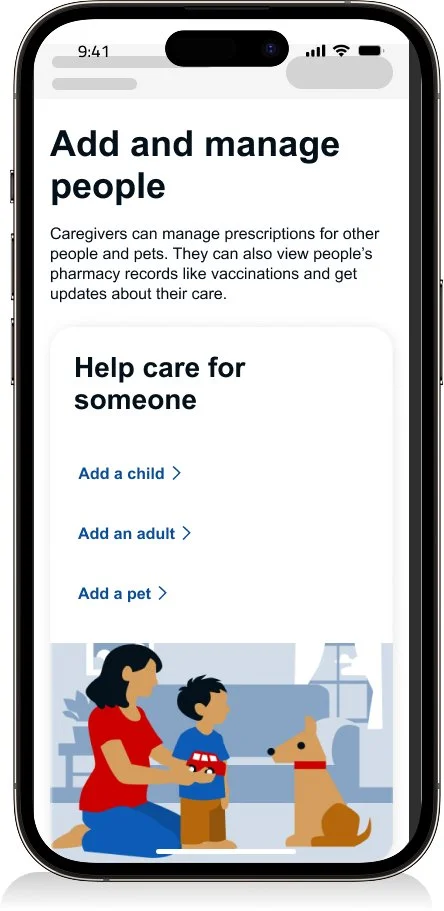
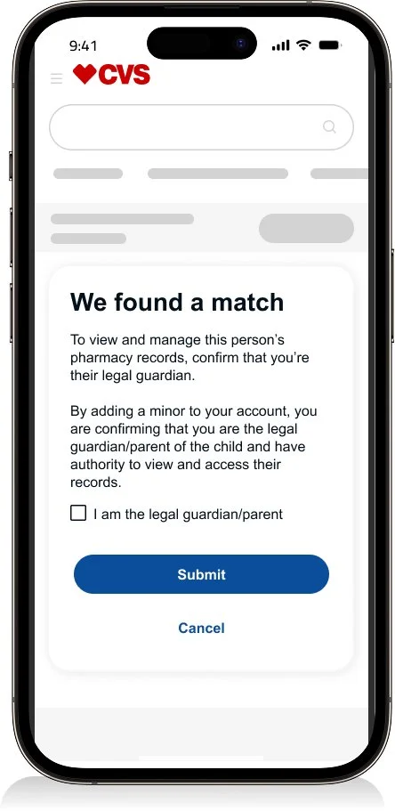
Adding a child flow
Prototypes captured key interactions to ensure the experience felt helpful—not disruptive. The design emphasized refined input behaviors, including validation, focus states, and auto-advancing fields, to create a smooth and intuitive flow.
“I can share additional prototypes that explore adding adults, or pets, along with caregiver invitation flows.”
Dev hand off
See the Design Process and Systems section to explore how I approach annotations, accessibility, and error management through a centralized catalog that drives consistency.
Full flow
I created comprehensive user flows in collaboration with engineering and architecture to ensure end-to-end alignment. I documented key states and edge cases—including preloading, retry attempts, and system nodes—to support accurate and predictable implementation.
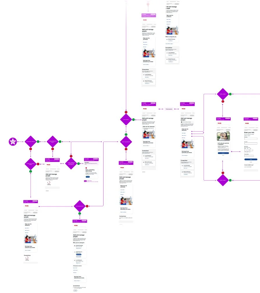
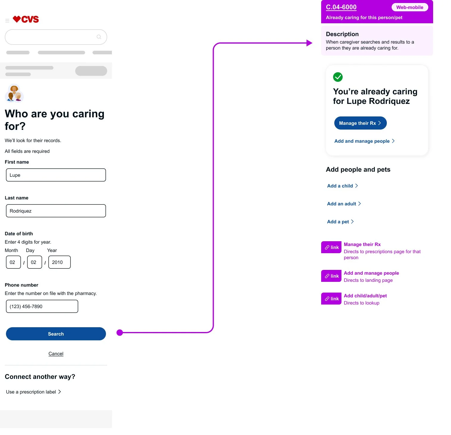
Error handling
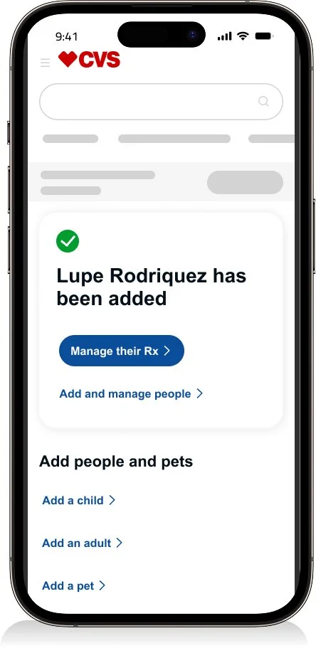
I designed for edge cases where technical constraints limited standard error patterns. In one scenario, a user attempted to look up a person they were already caring for. Because the system could not remain on the lookup page or display an inline error banner, I evaluated alternative patterns that would best support the user.
Instead of treating the outcome as an error, I redirected the flow to a success-style confirmation page. The action itself was valid, and the confirmation reinforced the existing relationship without implying a mistake. This solution balanced usability with technical constraints and demonstrated the importance of close collaboration with engineering partners.