
CVS Health - Caregiving
Brings people, pets, and caregivers together in one secure, connected experience.
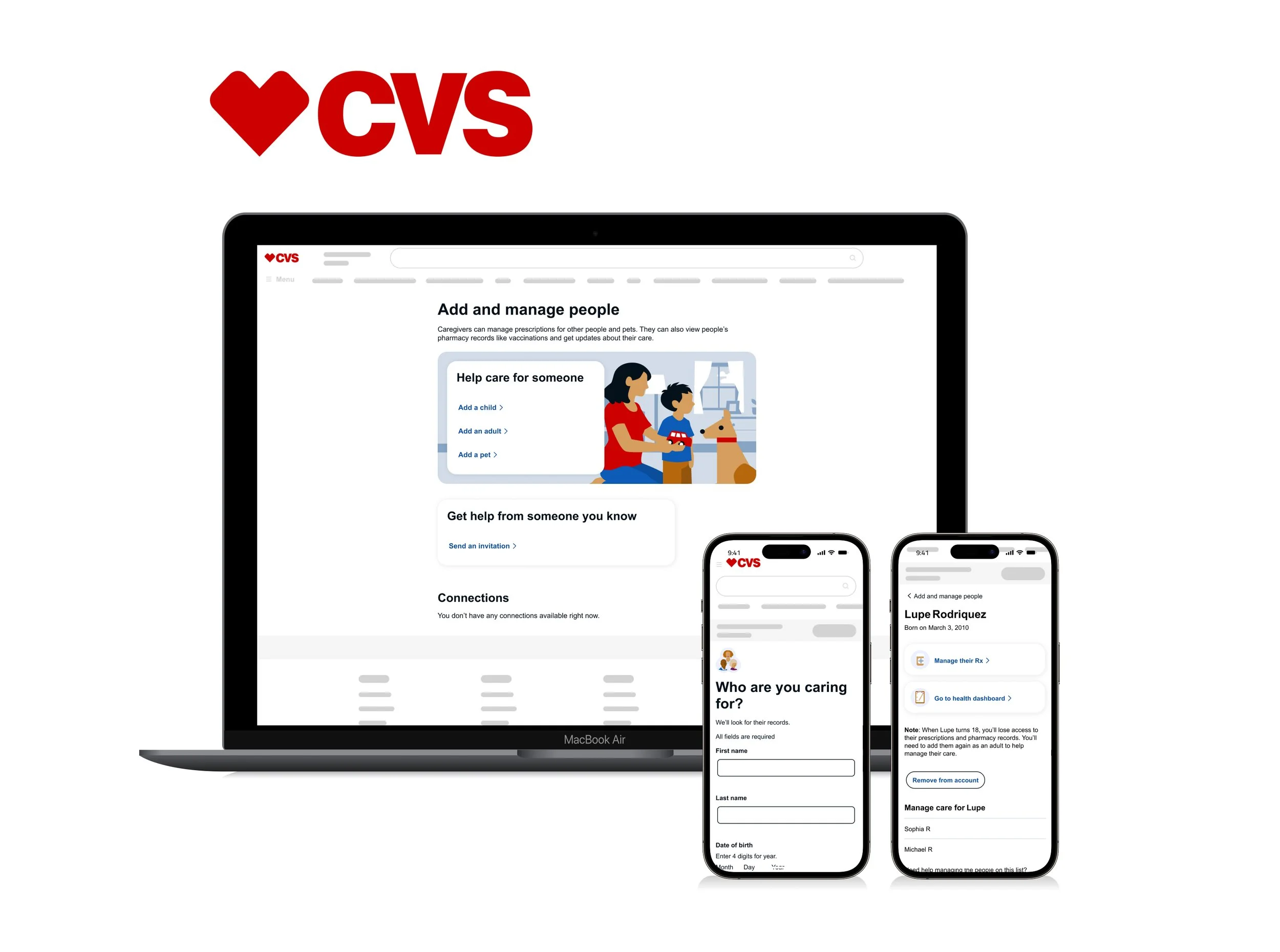
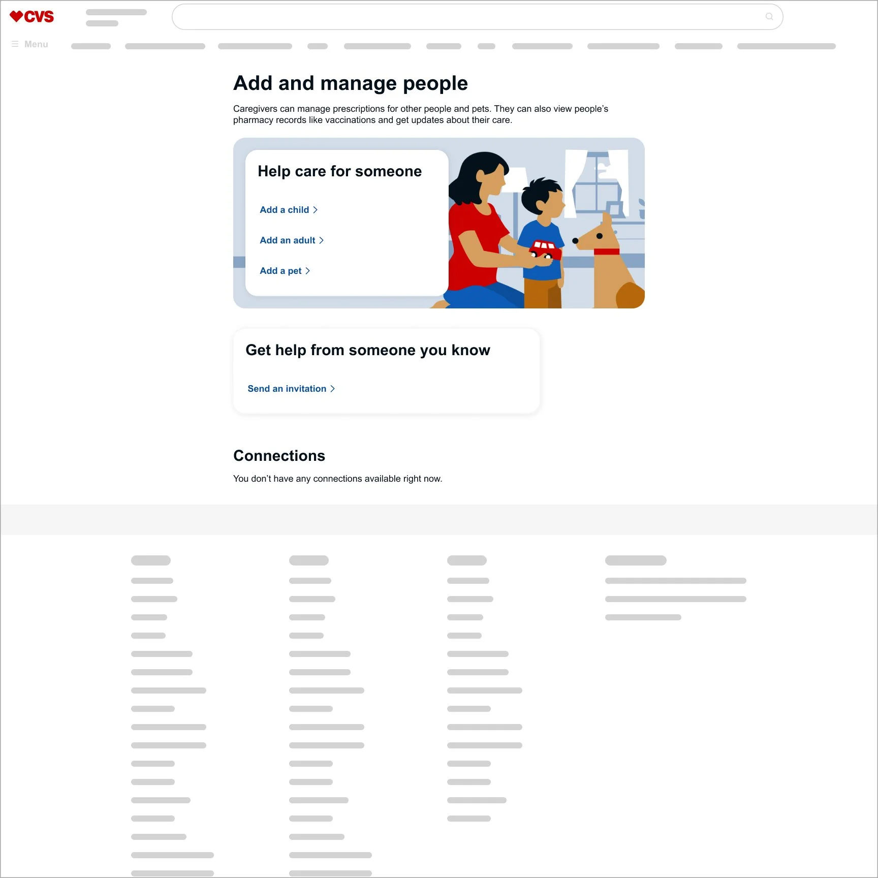
Landing page — before and after
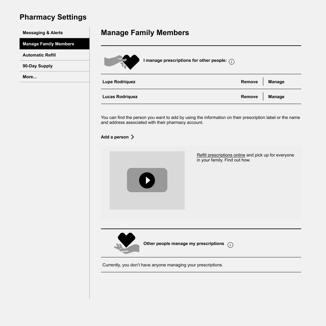
Challenge
The original design had grown over time. Content lacked a clear hierarchy, navigation added little value, and accessibility concerns made key actions harder to discover. The experience also left little room to scale as new features were introduced.
Solution
I focused on making the experience feel lighter and more intuitive. By simplifying the structure, clarifying the messaging, improving accessibility, and designing for future growth, the dashboard became easier to navigate and easier to evolve.
“From 240 to 500 daily active users—driven by clearer flows, lower friction, and a more intuitive experience.”
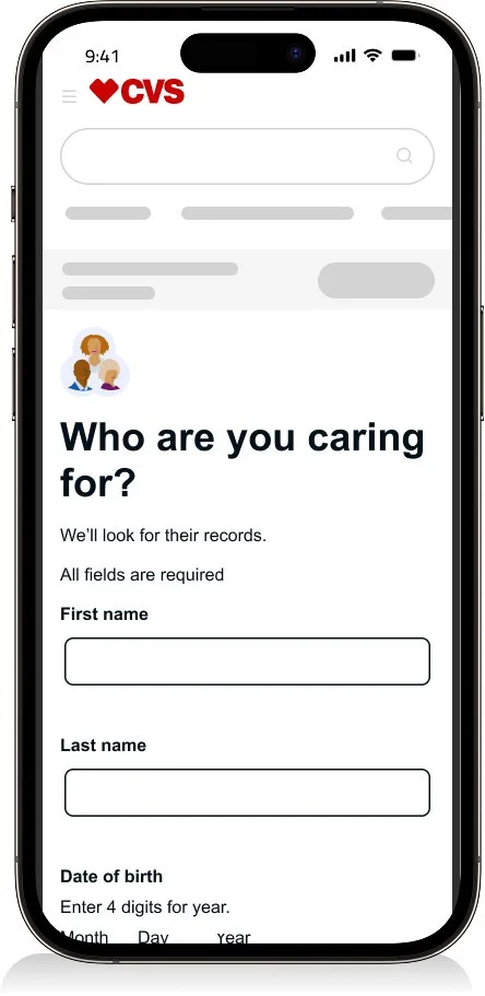
Look up — before and after
Challenge
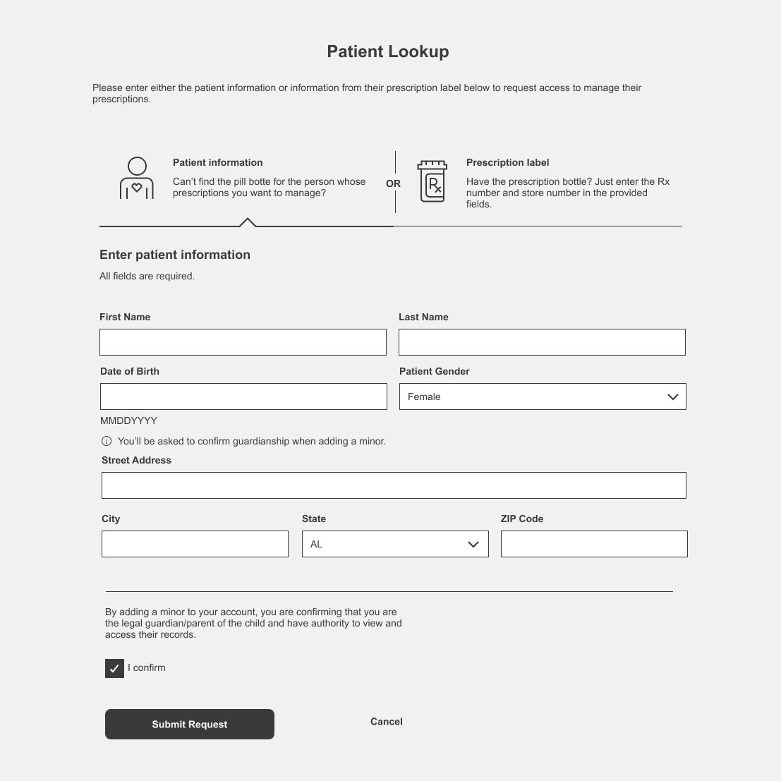
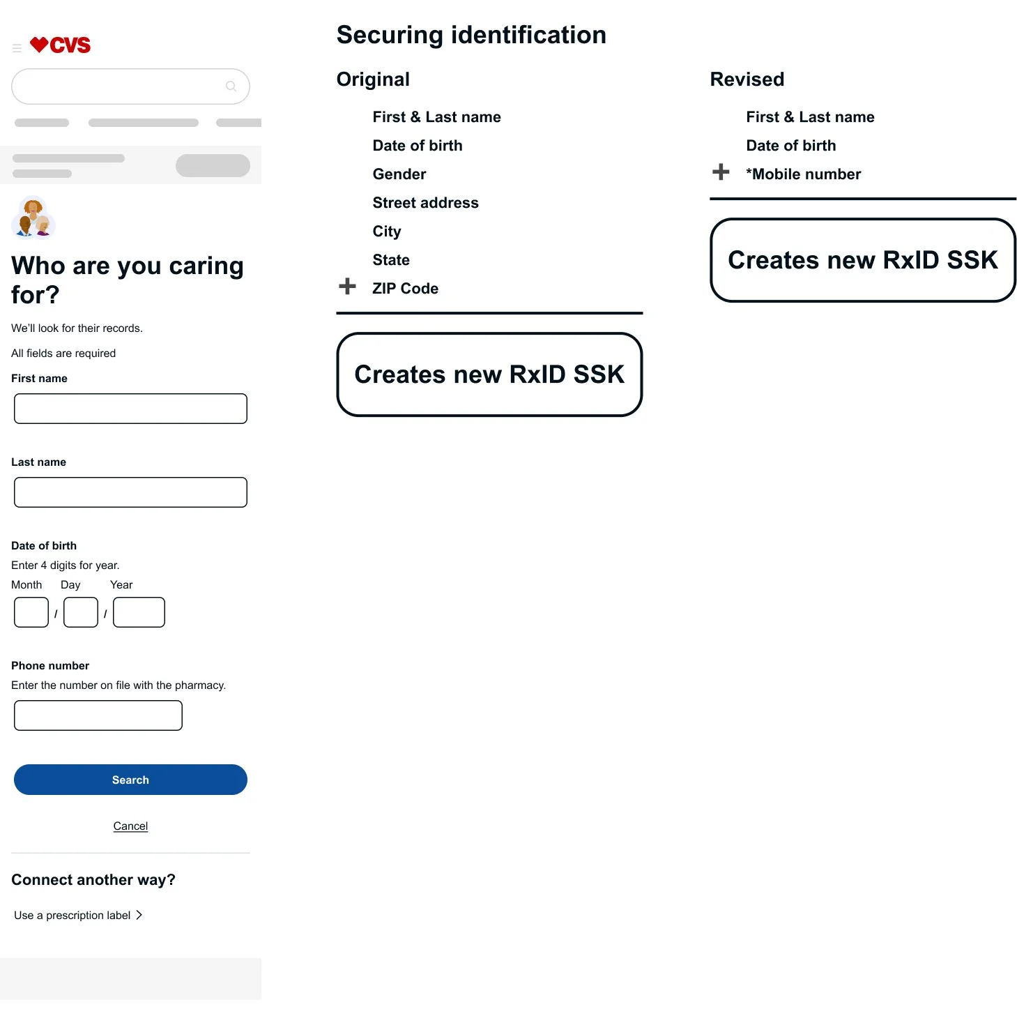
The original flow introduced unnecessary complexity. Too many fields, unnecessary information, and inconsistent experiences increased friction and made errors more likely.
Solution
I simplified the lookup experience by reducing the number of required fields from eight to four, keeping only the information needed to securely identify the user. I also aligned the experience across desktop and mobile, creating a faster, more consistent journey.
“From 40% to 93% user success—driven by a simpler, clearer lookup experience.”
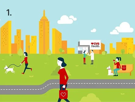
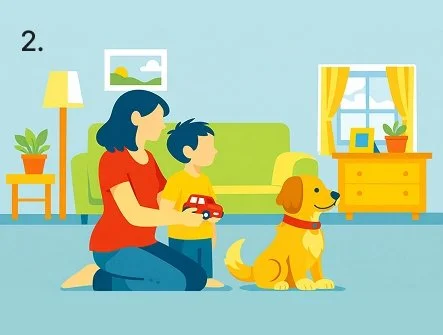
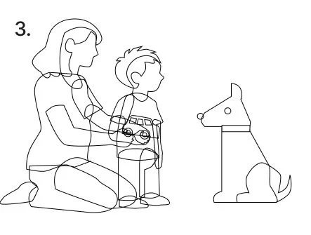
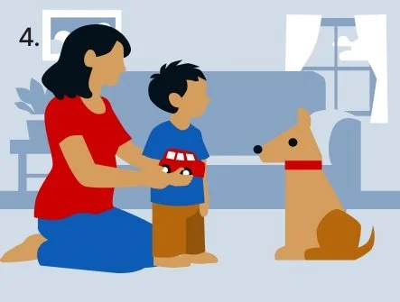
AI Illustration Process
Establish the style
Used the CVS Health illustration style guide to create a consistent AI prompt.Generate concepts
Created an initial illustration using AI as a starting point.Refine for production
Rebuilt the artwork with layered vectors to support future animation and editing.Finalize the artwork
Applied CVS color variables, refined the composition, and prepared the illustration for production.
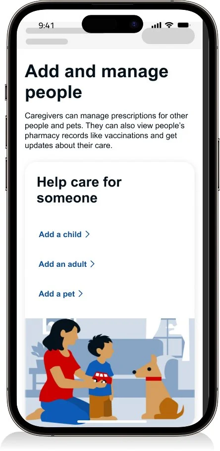
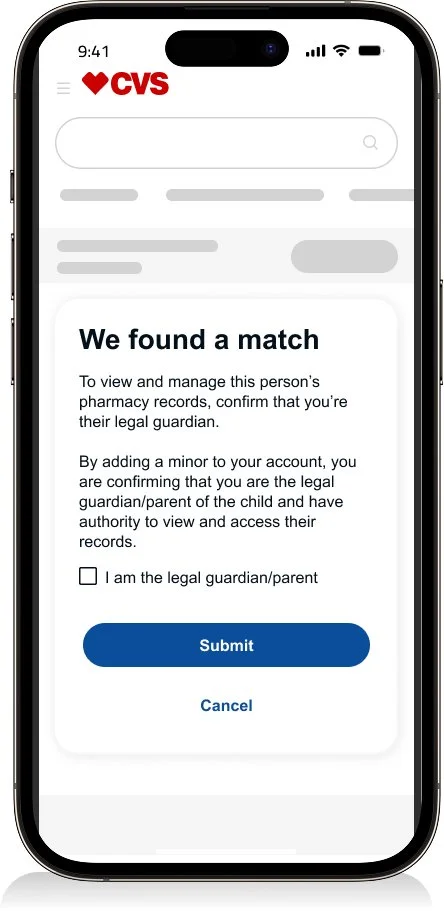
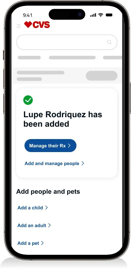
Adding a Child Prototype
Explore the interactive prototype to experience the complete “Add a Child” flow.
Dev hand off
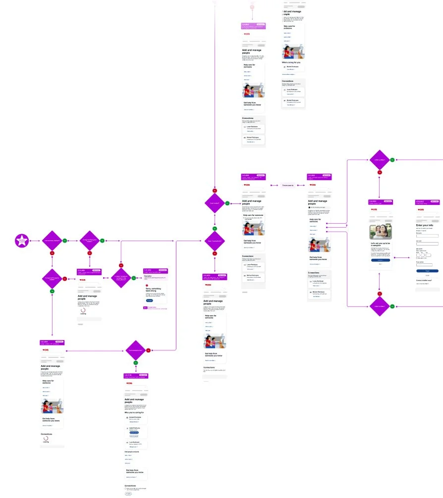
Full flow
I document end-to-end user flows so design, engineering, and architecture stay aligned from concept to implementation.
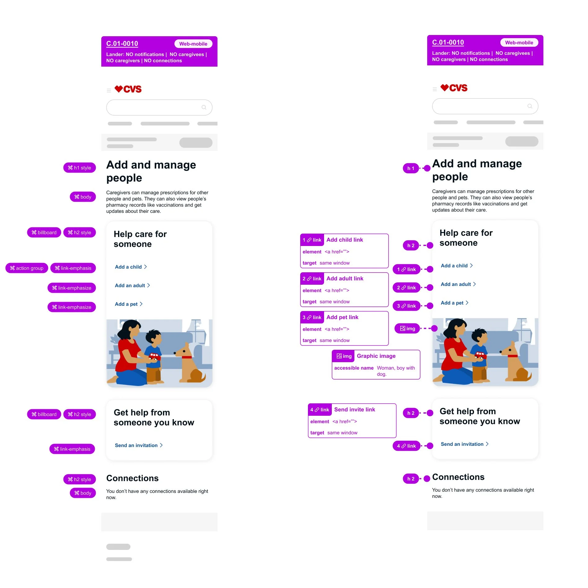
Annotations
I document design system and accessibility requirements so engineers can build with clarity and confidence.
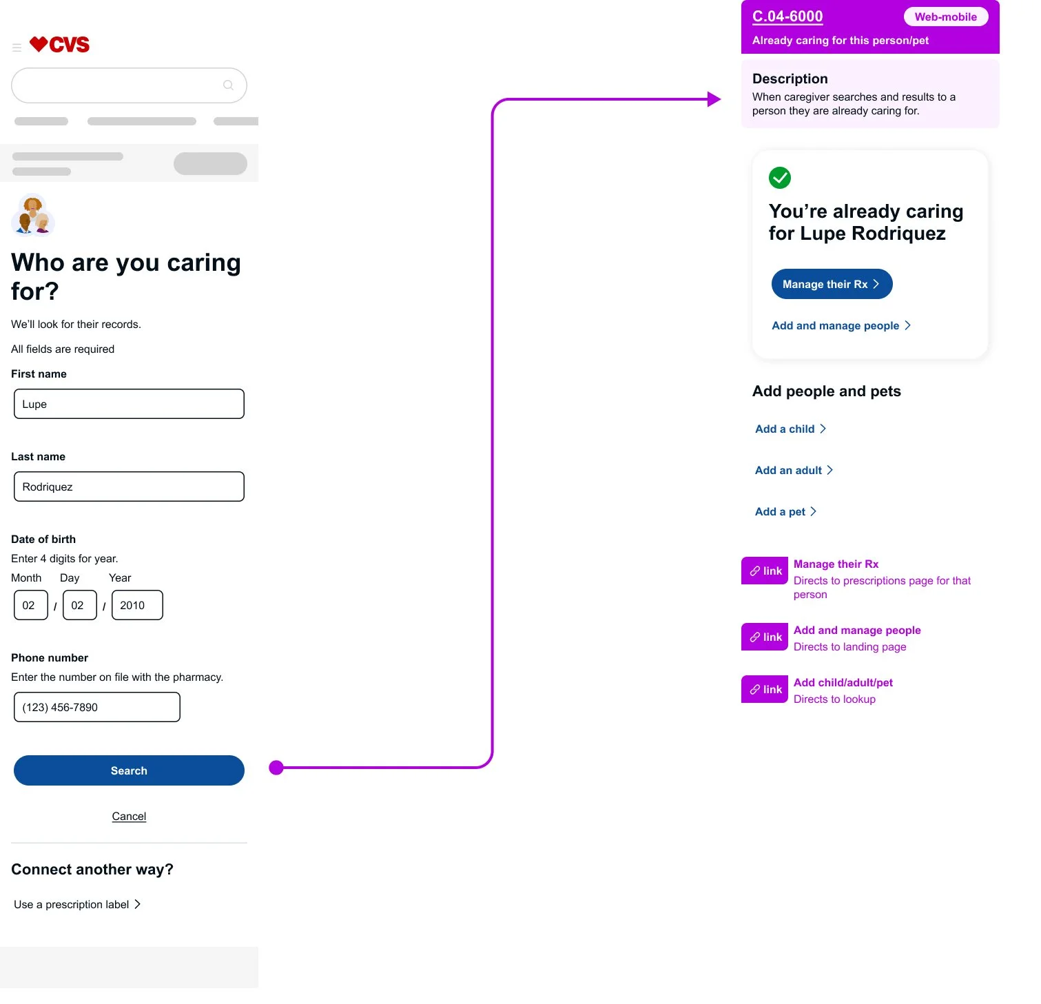
Error handling
I designed edge-case experiences by balancing usability with technical constraints. When users attempted valid actions that couldn't follow a standard error pattern, I introduced alternative confirmation states that reduced confusion and kept the experience intuitive.
Quisque iaculis facilisis lacinia. Mauris euismod pellentesque tellus sit amet mollis.