
Verizon’s AIM reporting dashboard
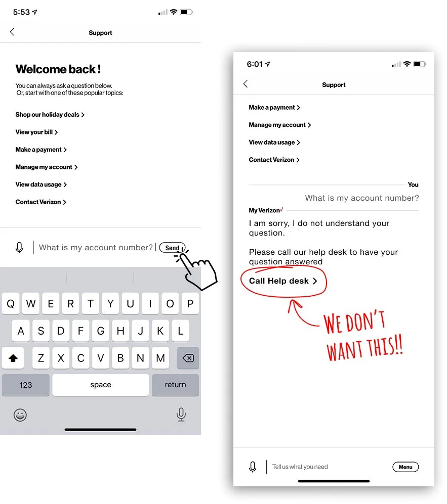
Verizon’s AI-powered chat system assists customers inside the mobile app with common questions and account tasks. When the AI cannot confidently respond, the conversation escalates to a live representative, an outcome that increases customer care costs.
To improve the system, we designed a Reporting Dashboard that allows internal teams to monitor AI chat performance and identify where conversations “fall out” of the automated experience.
The dashboard analyzes thousands of chat interactions and surfaces patterns where the AI fails to resolve requests. These insights allow teams to refine the chatbot’s responses and reduce unnecessary escalations to live agents.
Why we created this
The existing system lacked the visibility and usability needed to effectively manage AI conversations.
Teams struggled to understand where chat failures were occurring, and updating or creating new chatbot conversations required a slow and inefficient workflow.
Improving the system required both better analytics and a more intuitive interface.
My Role
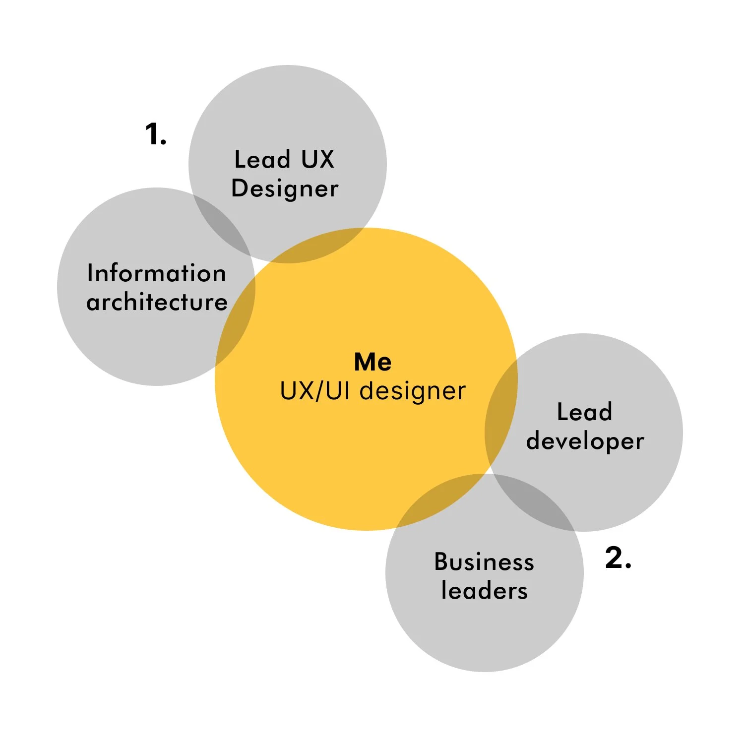
Information Architecture & UX Structure
Defined the information architecture for the reporting dashboard, organizing complex AI conversation data into a clear and scalable interface in collaboration with the Lead UX designer.Cross-Functional Collaboration
Worked closely with business leaders and the Lead Developer to validate design direction, ensuring UI patterns and functionality aligned with product goals and technical feasibility.
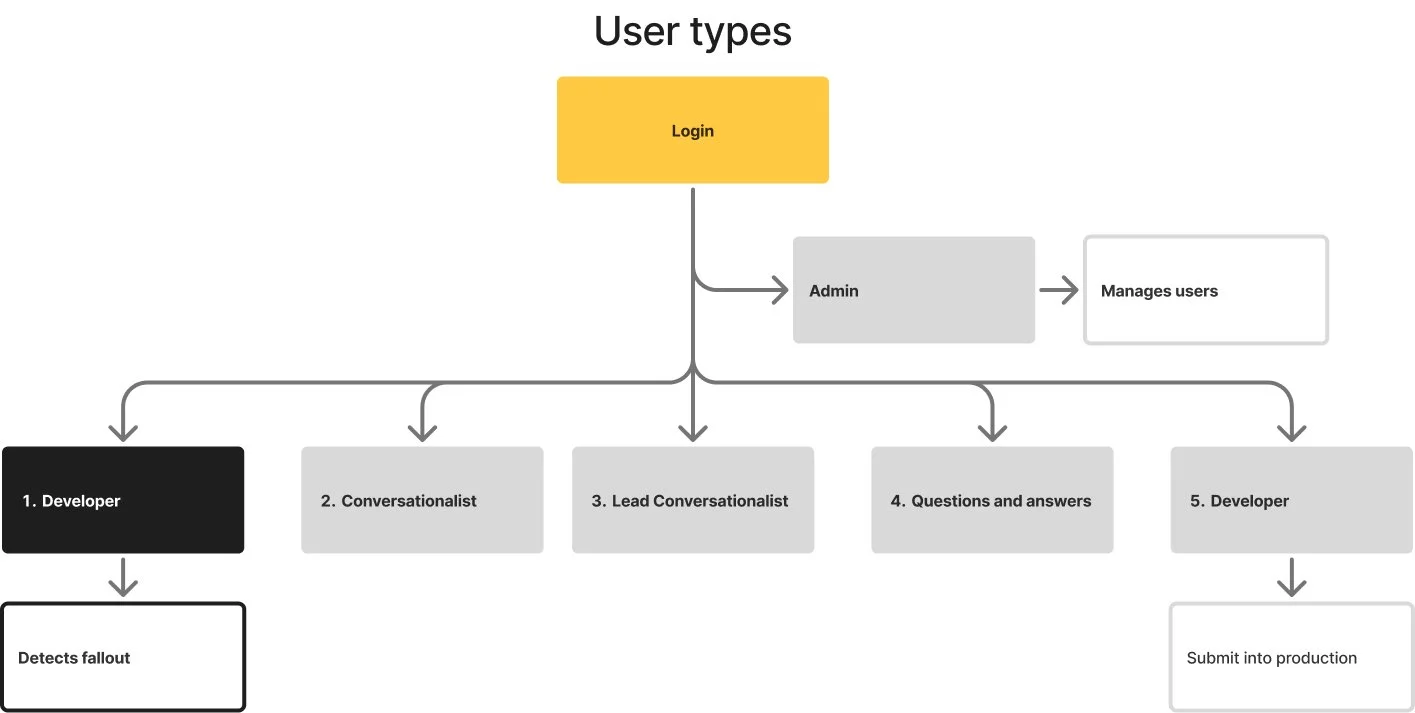
User Roles & Workflow
Admin → Developer (Detect Fallout) → Conversationalist → Lead Conversationalist → Q&A → Developer (Deploy Fix)
The reporting dashboard primarily supports Developers, who monitor AI chat traffic to detect conversation fallouts—cases where the chatbot cannot answer a user and escalates to a live representative. These insights move through the workflow to refine responses and deploy improvements back into production.
The Design Challenge
The new reporting dashboard needed to surface meaningful insights from thousands of AI chat messages.
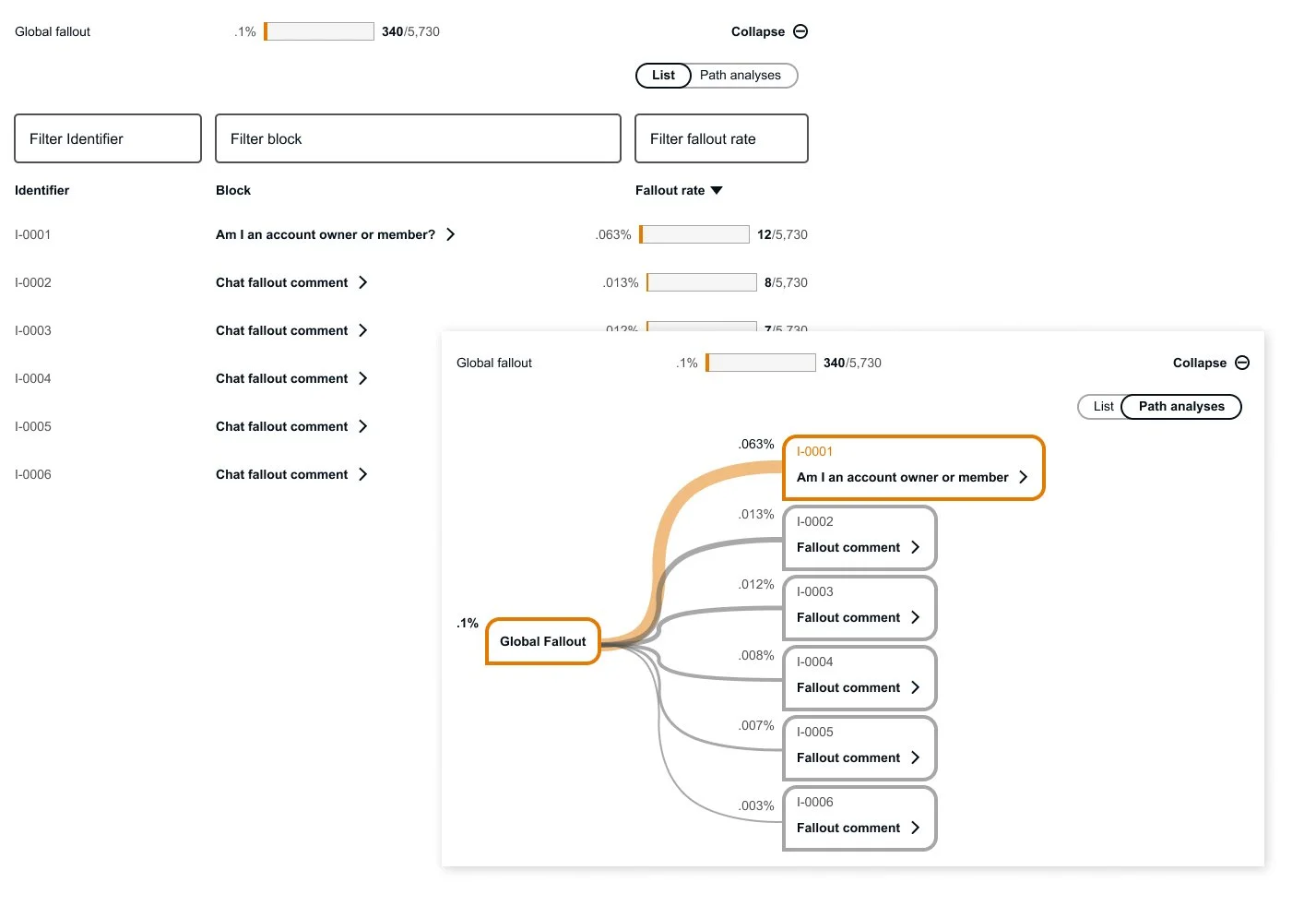
Each message contains multiple labels and metadata used to categorize conversations, channels, and entry points. These labels are nested within each other, creating a complex data structure.
The challenge was to design an interface that could:
Identify where fallouts occur within large datasets
Present layered conversation metadata clearly
Consolidate complex information into a simple, understandable UI
Enable teams to quickly act on insights
The goal was to transform raw conversational data into clear and actionable intelligence.
Design System & Layout Framework
UI Framework
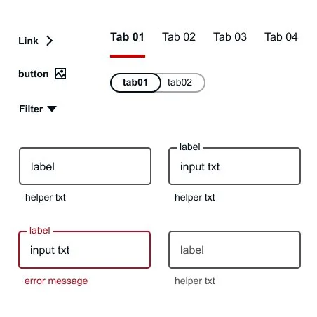
The interface was built using Google Material Design components to ensure consistency and scalability.
Material’s component library provided standardized patterns for:
Data tables
Filters and controls
Charts and visual indicators
Navigation elements
This allowed the design to support complex data while maintaining clarity and usability.
Layout & Screen Format
The dashboard was designed specifically for desktop and laptop environments, where internal teams analyze large volumes of data.
Layout specifications included:
12-column grid system
16px gutter spacing
Structured regions for filters, charts, and lists
This grid allowed the interface to accommodate dense datasets while maintaining visual balance.
Information Hierarchy
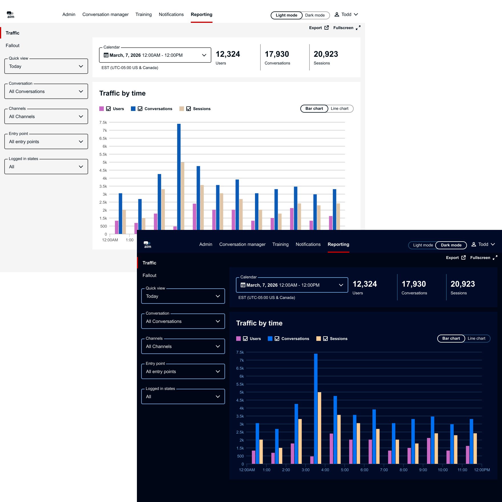
The interface is structured to give teams quick access to chatbot performance insights and key reporting tools.
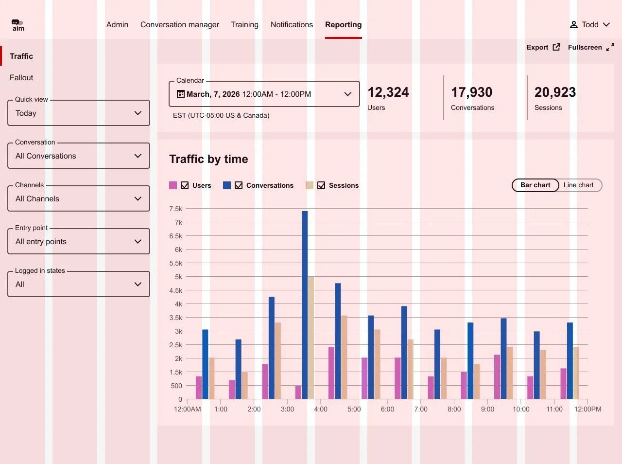
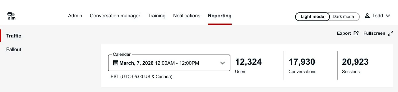
Global Navigation – Provides access to major platform areas, with the primary focus on Reporting, where chatbot performance is monitored.
Supporting Controls – Allows users to export reports or display the dashboard in fullscreen mode for presentations and team reviews.
Traffic & Fallout Views – Enables users to switch between overall conversation activity (Traffic) and unresolved chatbot interactions (Fallout).
Summary Banner – Displays key metrics such as time period and total users, giving teams a quick snapshot of chatbot performance.
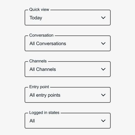
Filters
Filters allow teams to isolate patterns and identify where issues occur within chatbot conversations.
Key filters include:
Quick View
Conversation Type
Channel
Entry Point
Logged-in State
These filters enable users to refine data and quickly pinpoint trends or problem areas in the AI chat experience.
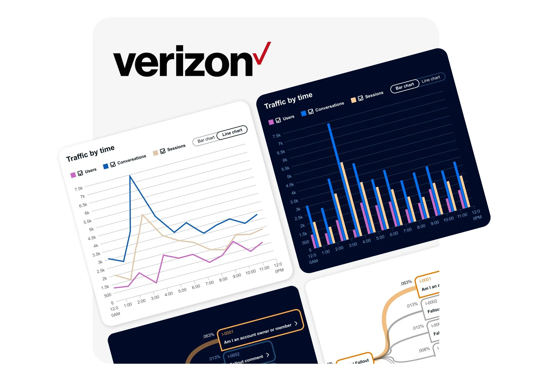
Data Visualization & List
The main stage combines visual analytics with detailed conversation data to support both high-level monitoring and deeper investigation.
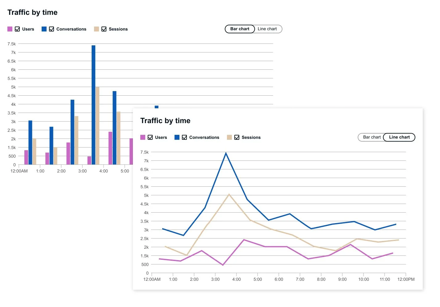
Timeline Chart – Displays overall traffic and fallout patterns, helping teams quickly identify trends in chatbot performance.
Conversation List – Provides detailed conversation records and message labels for deeper analysis.
Layered Insight – Enables users to move seamlessly from macro-level trends to specific chatbot interactions that require attention.
Prototype
Explore the interactive prototype to experience the reporting dashboard in action. For the best experience, the prototype is recommended to be viewed on a desktop, where you can interact with features such as switching between Traffic and Fallout views, toggling bar and line charts, expanding nested conversation data to explore chat details, and switching between light and dark modes.
Conclusion
The Reporting Dashboard works alongside the AI chat system to provide a clear visual representation of chatbot performance and problem areas. By surfacing conversation traffic and fallouts, the tool enables teams to quickly identify gaps in the AI experience and prioritize improvements.
The insights generated from the dashboard support informed decision-making and highlight opportunities for future enhancements, while reinforcing the business value of AI chat features across the platform.