
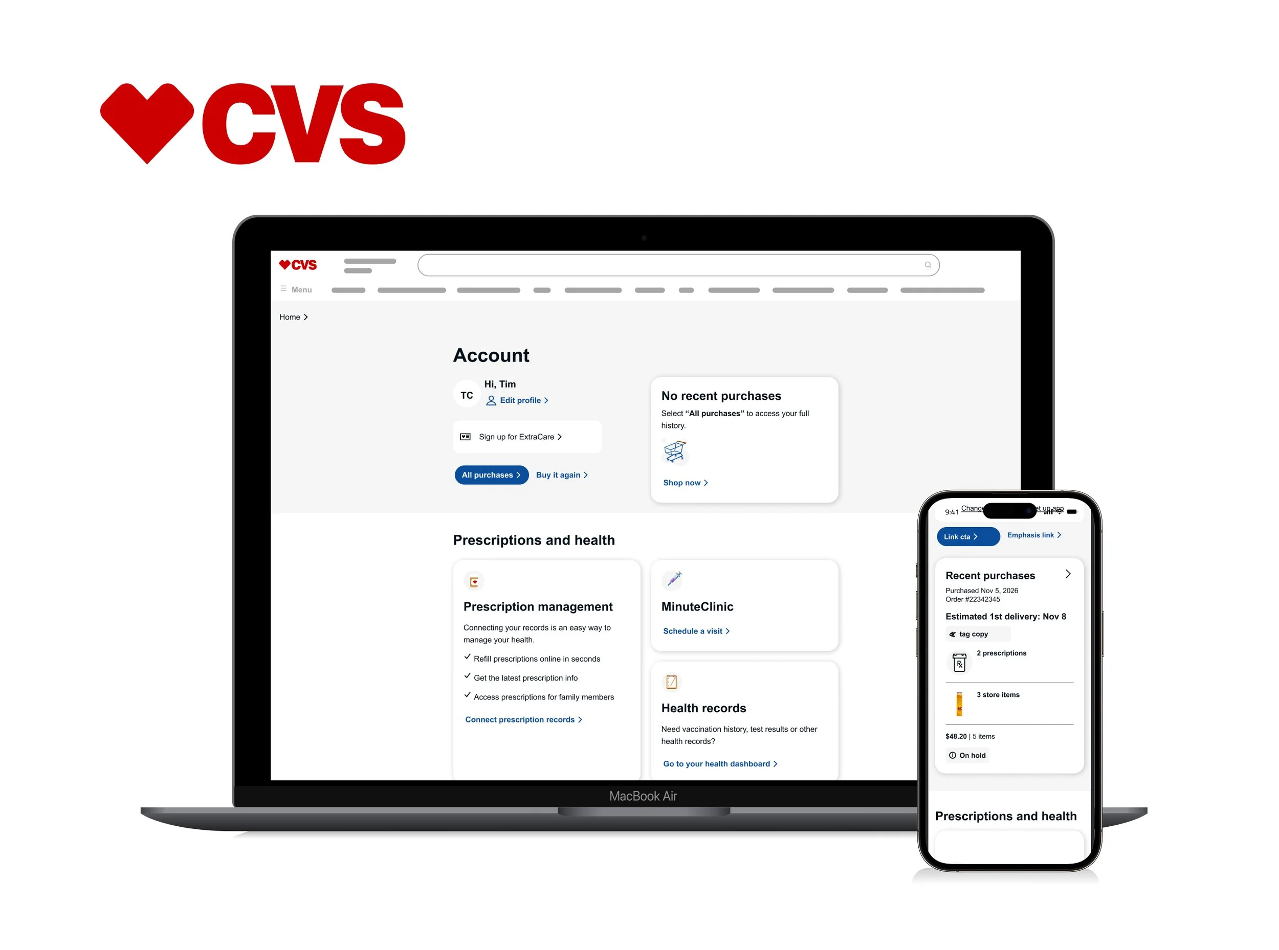
CVS Account Lander
The CVS Account Lander centralizes key experiences across the CVS ecosystem, giving users quick access to purchases, prescriptions, MinuteClinic services, health records, billing, payment methods, profile settings, and pharmacy savings programs such as ExtraCare and Rewards. I redesigned the experience by restructuring the information architecture to create clearer navigation, improve accessibility, and modernize the overall interface. The updated approach simplified how users move between critical tasks while creating a more scalable and consistent experience across the platform.
My role
Define the design direction
I partnered closely with the Design Lead and UX Lead to shape the experience direction, aligning user research with the updated information architecture.Present and validate solutions
I presented design explorations to leadership, product owners, and cross-functional stakeholders to validate the approach. I also collaborated with copy strategists to maintain brand-aligned language while working alongside development leads to identify technical constraints early in the process.Finalize and hand off
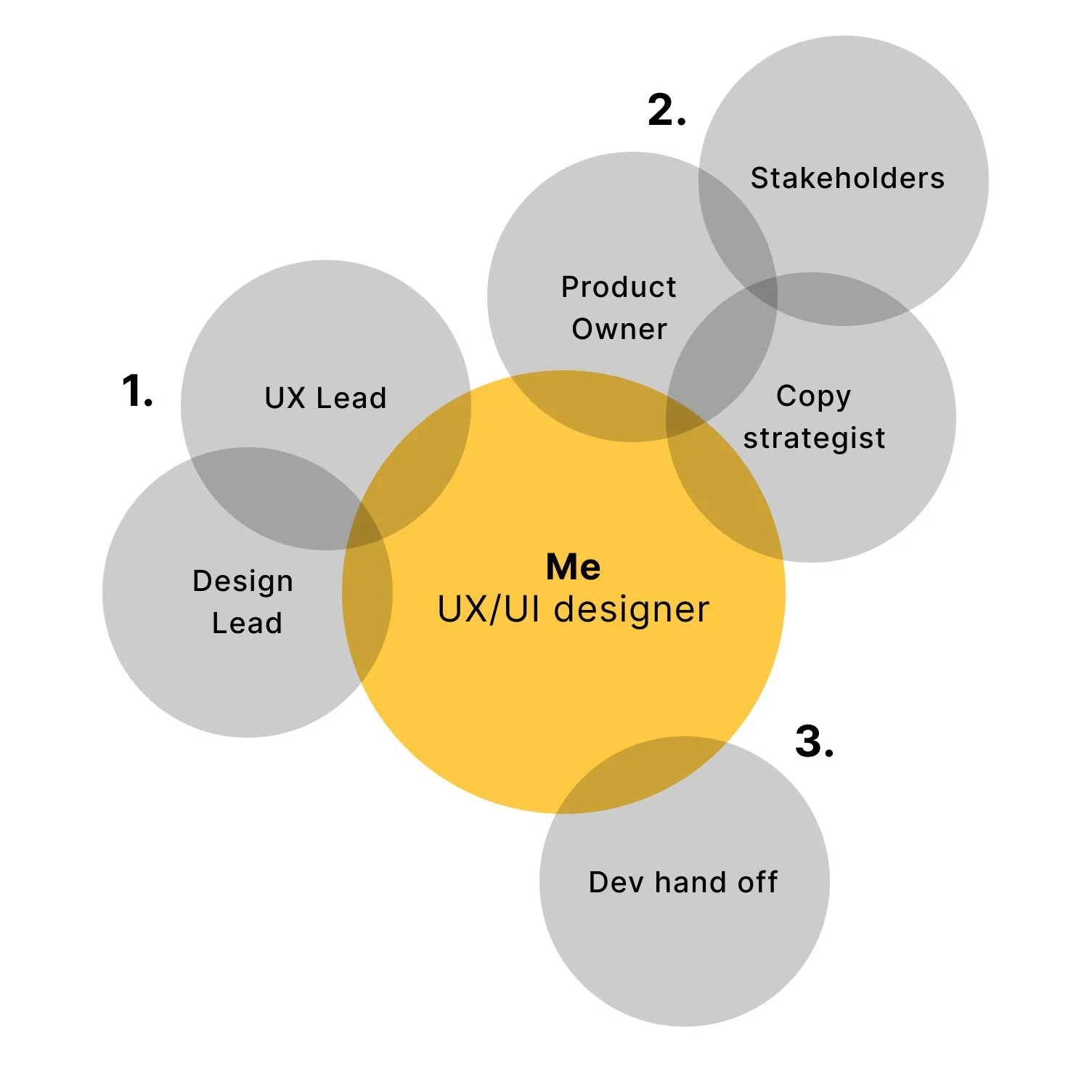
I refined approved designs and prepared developer-ready files with detailed annotations and accessibility guidance. After handoff, I partnered with engineering through QA to ensure the final experience aligned with the intended design and functionality.
Account Lander — before and after
Original Account Lander
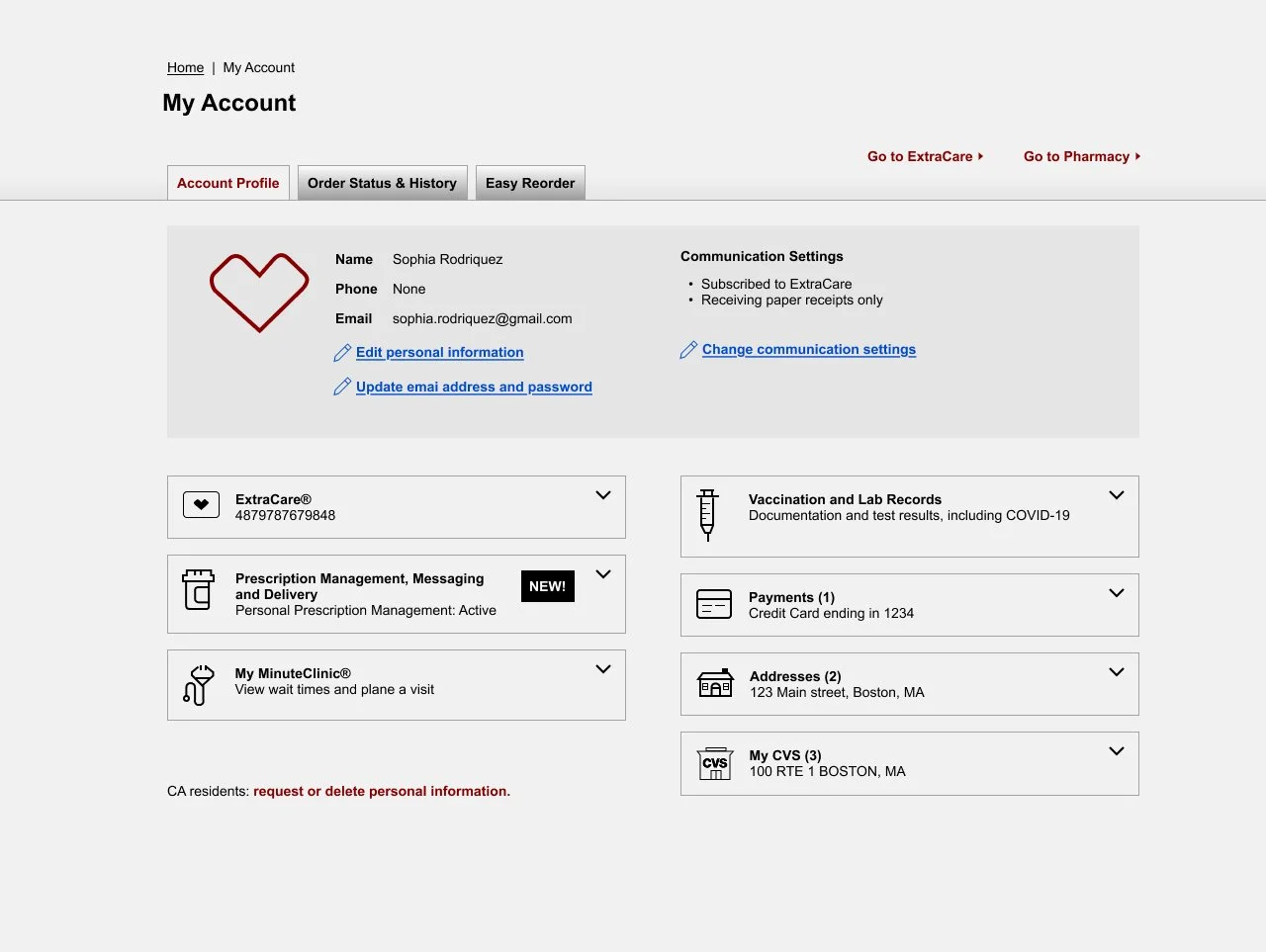
Why the original design needed improvement
Updated information architecture — I reorganized content groupings based on user research and expected navigation patterns, moving some experiences into dedicated pages while consolidating others into the landing page.
Accessibility limitations — important actions and information were hidden within expanders and tabbed interfaces, creating accessibility challenges and reducing discoverability for users.
Outdated visual design — the experience required a refreshed visual system, creating an opportunity to introduce updated CVS branding, including typography, color, iconography, and component styling.
Improved Account Lander
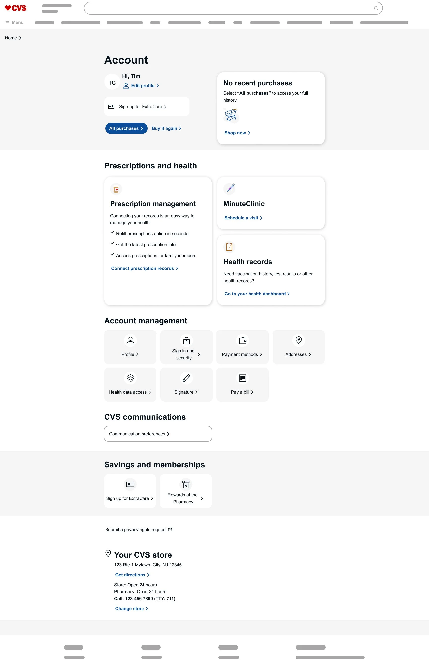
Why the updated design works for users
Restructured content categories — I reorganized segments based on research findings and expected user behaviors, creating clearer navigation and more intuitive groupings.
Added recent purchases — I introduced quick access to recent purchases, helping users return to common tasks more efficiently.
Improved scalability — I designed segments with supporting subcategories, allowing the experience to grow without overwhelming users with too many actions in a single area.
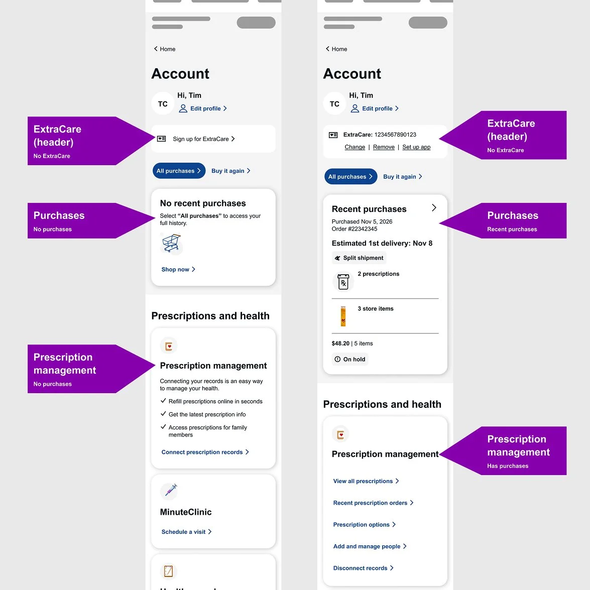
Designed adaptive account states — I tailored the experience based on user status, such as prescription connectivity or ExtraCare membership, presenting relevant actions, guidance, and benefits when needed.
Modernized the visual design — I incorporated updated CVS branding, including refreshed visuals, typography, color, and iconography.
Resolved accessibility concerns — I removed hidden critical information and ensured all actions remained visible, discoverable, and accessible.
Responsive direction
I documented responsive behaviors across different account states to ensure the experience remained clear and consistent across devices. I used visible tagging and structured annotations to clearly communicate layout changes and interaction patterns, reducing ambiguity for engineers during implementation. This approach also helped product managers and owners document requirements more effectively.
Developer Handoff
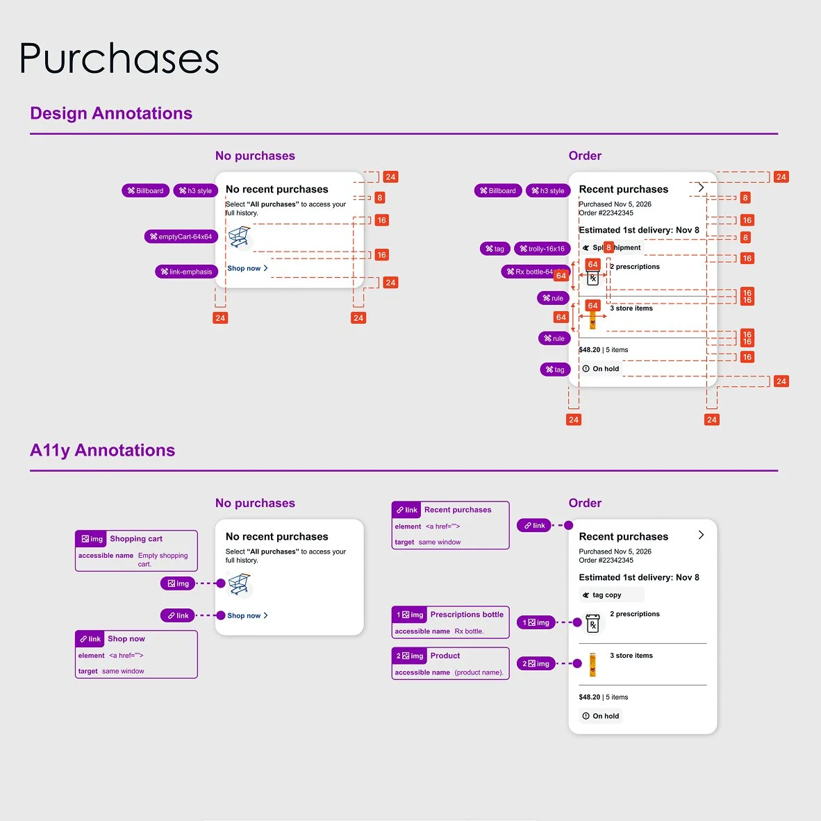
I deliver clean, developer-ready handoffs with clarity and precision. I document every detail to reduce ambiguity, align teams, and support accurate implementation.
Design and accessibility annotations
I structure developer handoff using a two-tiered annotation system. Design annotations define design system components, spacing, layout behavior, and visual specifications, while accessibility annotations document interaction behaviors, semantic structure, focus states, and action requirements. This approach helps engineering teams build consistently, accurately, and accessibly.
Account Landing Exploration
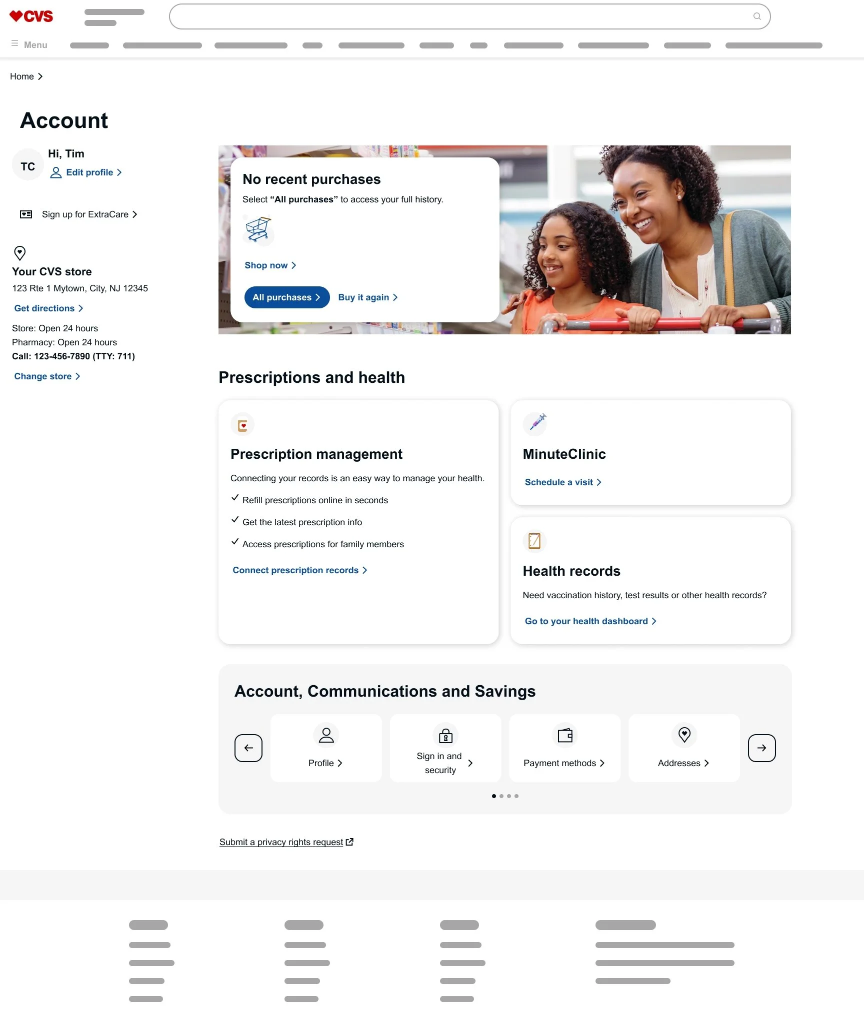
I explored early concepts for the Account Dashboard to evaluate ways to simplify and streamline the experience. While the two-column layout created a clear separation between account actions and supporting content, further evaluation revealed opportunities to better align the experience with user needs and the purpose of the dashboard.
Several design decisions helped shape the final direction:
Marketing-style imagery felt misaligned — while visually engaging, large promotional imagery shifted the experience toward marketing rather than reinforcing the utility and task-oriented nature of an account dashboard.
Carousel interactions reduced discoverability — although carousels reduced above-the-fold density, they introduced hidden actions and treated critical account links as optional, creating accessibility and usability concerns.
Overly broad content groupings created ambiguity — grouping actions under generalized categories such as Account, Communications, and Savings reduced clarity and made it harder for users to quickly identify relevant tasks.
This exploration helped validate a more scalable, accessible, and task-focused direction for the final experience.