
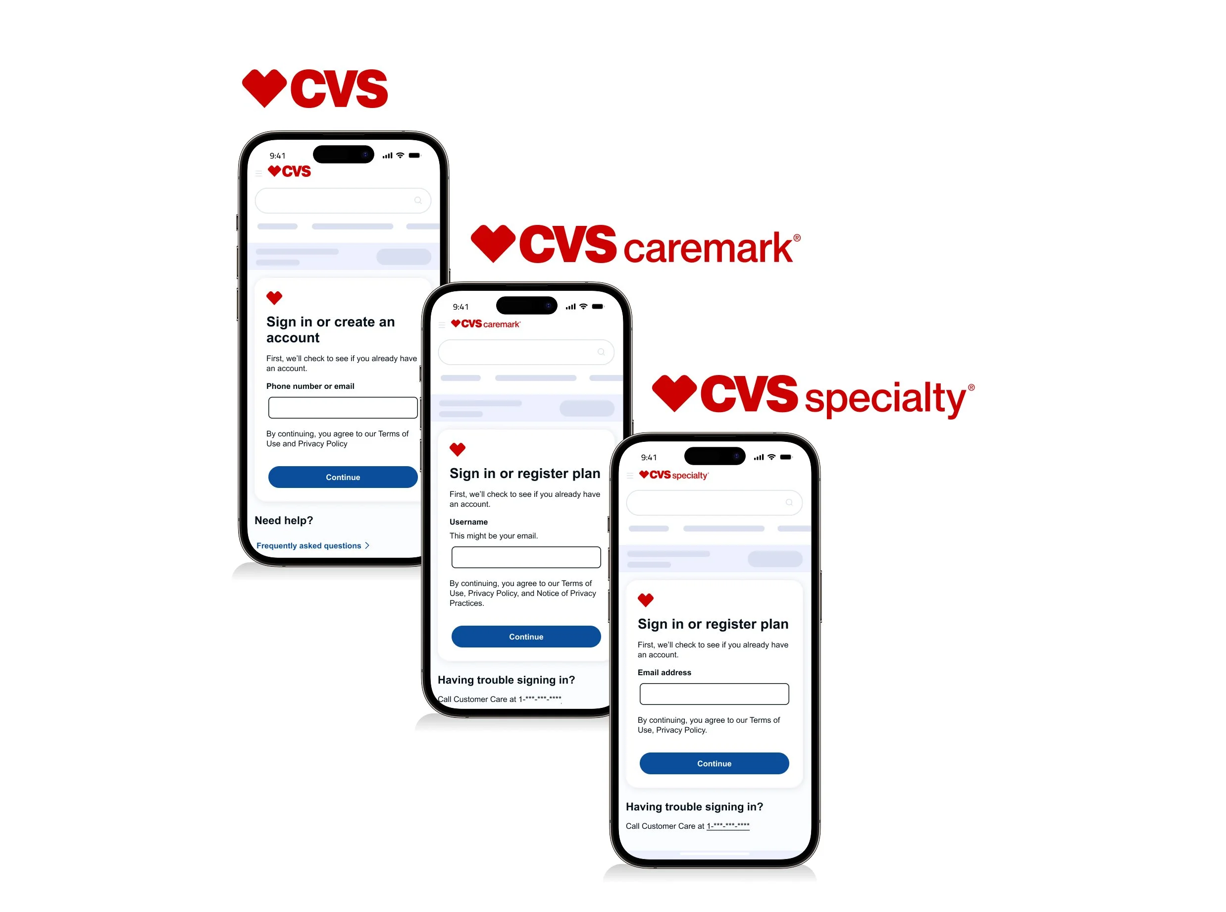
CVS Health - Sign in, Create account and Registration
The sign-in and registration experience is designed to securely authenticate users while keeping the process seamless. Users are identified through existing credentials—such as email, phone number, or username—depending on which CVS Health platform they are accessing (CVS Health, Caremark, or Specialty).
If a user is not found in the system, the flow transitions them into registration to establish a verified account. Across all three experiences, the focus remains on accuracy, security, and minimizing friction for the user.
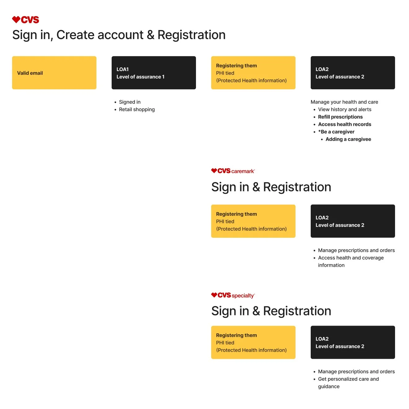
Overview
Authentication within CVS Health is structured across two levels of assurance. LOA1 supports basic access, allowing users to sign in and complete retail shopping.
LOA2 enables higher-trust access and introduces PHI (Protected Health Information), allowing users to securely manage sensitive features such as caregiver access, prescription refills, health records, and MinuteClinic scheduling.
For Caremark and Specialty, users are registered directly into LOA2, ensuring immediate access to experiences that require elevated authentication and protected health data.
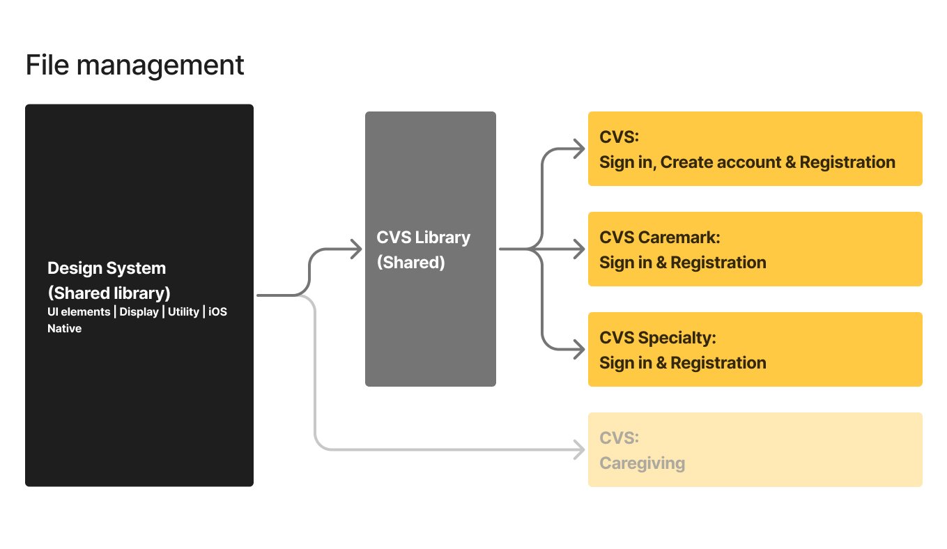
File management & shared libraries
I aligned experiences across three engineering teams supporting CVS Health, Caremark, and CVS Specialty to ensure consistency across platforms. This work directly supported the One App initiative by establishing shared patterns and behaviors regardless of entry point.
I maintained a single, shared Figma library, aligning all screens on a common grid so teams could easily compare designs, identify inconsistencies, and standardize solutions. This structure improved collaboration and helped product and engineering teams align on a unified experience.
“I can walk through how these shared libraries were structured and why they’re valuable across teams.”
My role
Identify opportunities
I reviewed metrics-driven recommendations from the product manager and partnered with the UX Lead and copy strategist to assess proposed changes within the flow, raising early technical and usability questions.Validate feasibility
I collaborated with the product owner, architect, and lead developer to resolve open questions, align on technical constraints, and confirm feasibility.Present design solutions
I explored and mocked up multiple design concepts, aligning them with current branding and accessibility guidelines through ongoing collaboration with the UI kit team. I presented recommendations to design leadership and cross-functional stakeholders for review and alignment.Finalize and hand off
I refined approved screens and delivered developer-ready Figma files, including detailed annotations, accessibility considerations, user flows, and assets to support implementation.

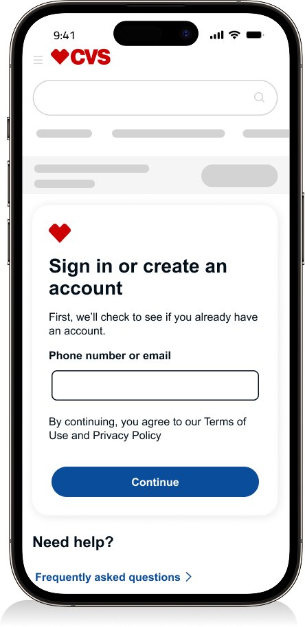
CVS Health - Sign in, Create account & Registration
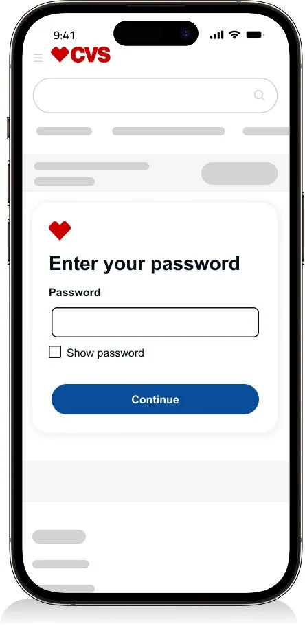
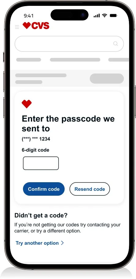
Sign in
Enter your username
Enter your password
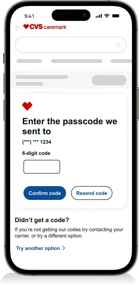
One time passcode
Successfully signed in
Results
The login flow supports an average weekly traffic of 78.6K users, with 64.1K successful authentications—an overall success rate of 81.6%.

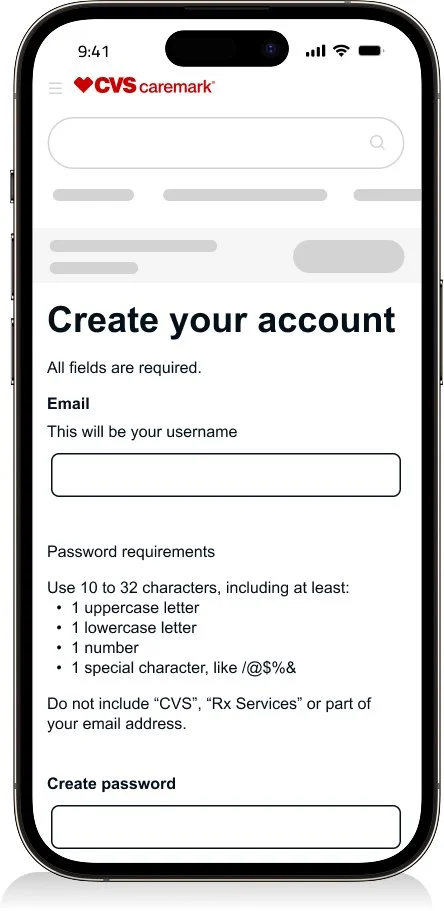
Create an account
Enter your username
Create an account
One time passcode
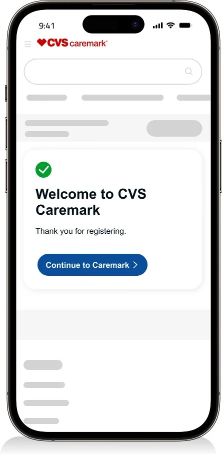
Successfully signed in
Results
The “Create an account” flow achieves a 90% overall success rate.

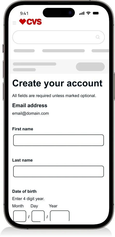
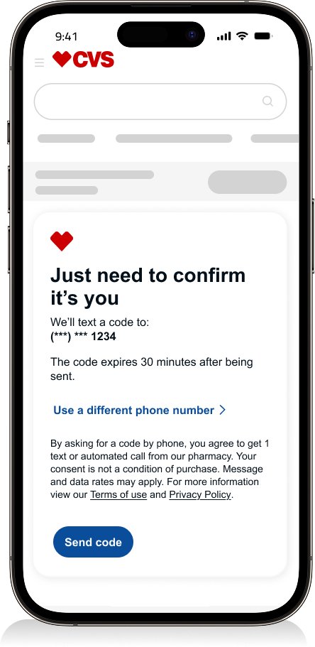

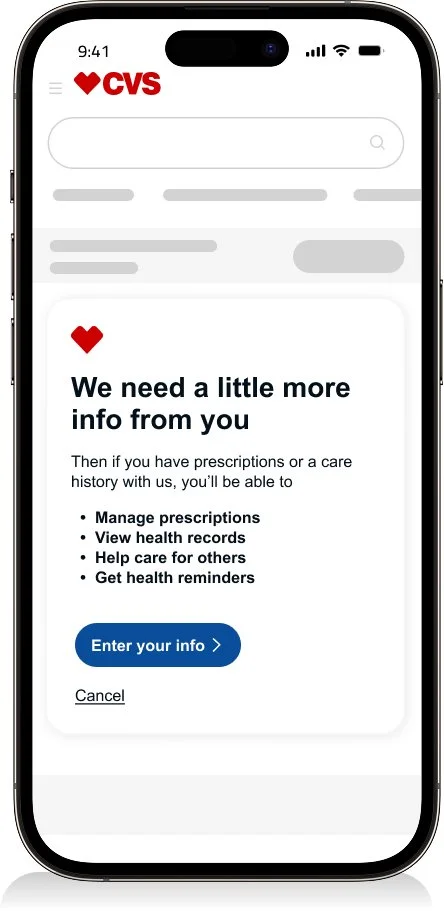
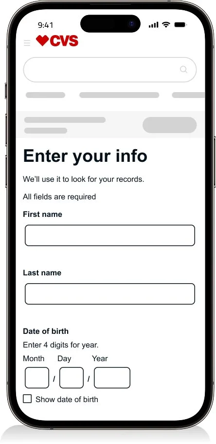
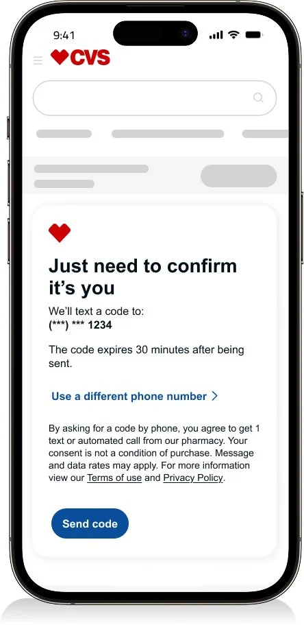
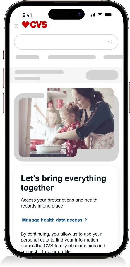
Registration
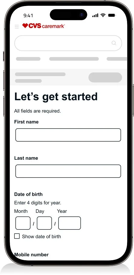
Intro
Enter your info
One time passcode
Consent
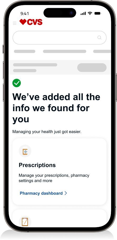
Successfully registered
Results
The “Registration” flow achieves an overall success rate of approximately 80%.

Registration Fail
Results
Lead to a +0.3% success
Original Registration Fail
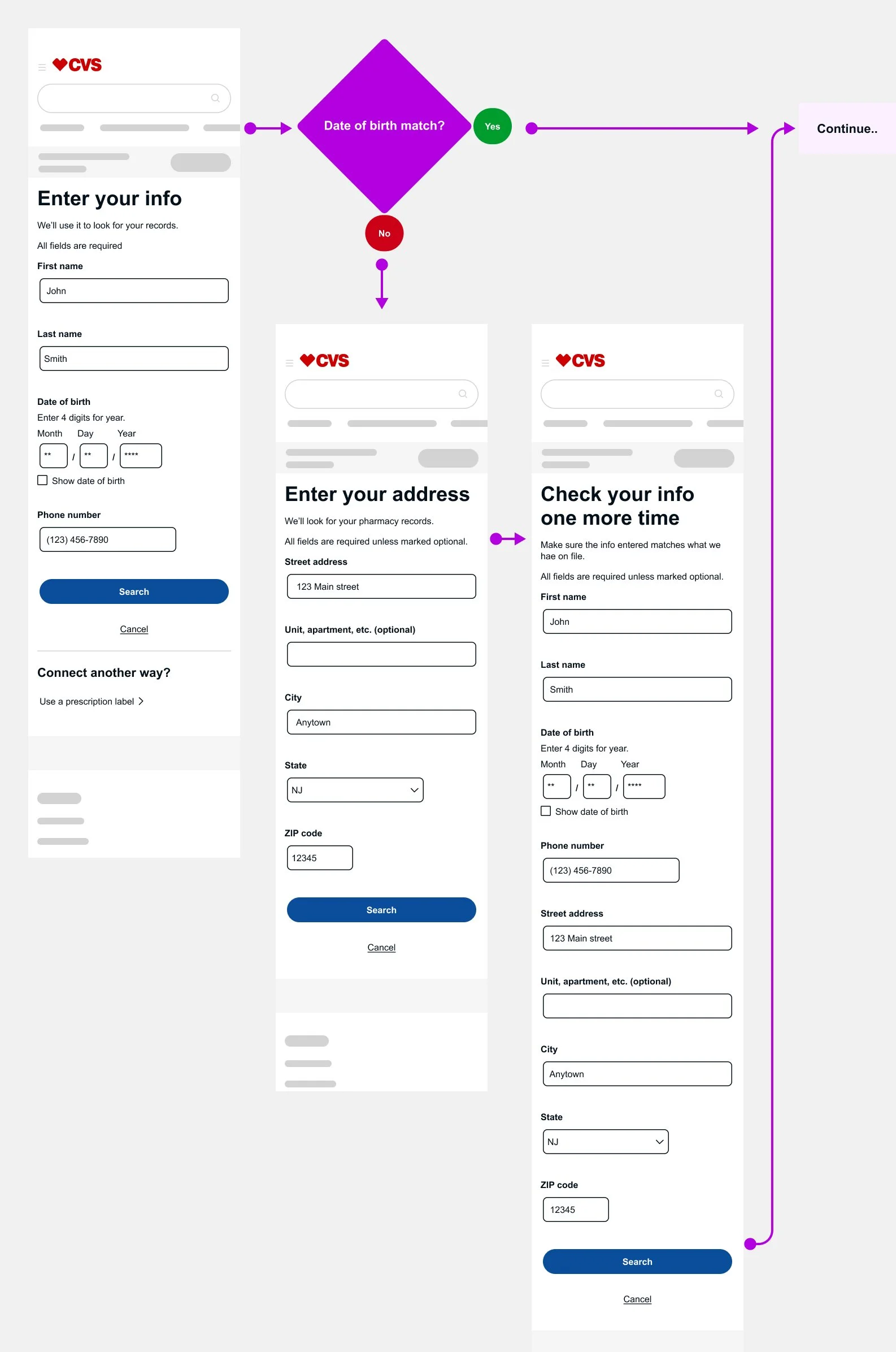
Before the update, Quantum Metrics data showed that users were entering their full date of birth, but one digit was often slightly incorrect. This error pushed users into a longer, more complex flow with multiple fields, increasing friction and drop-off.
Improved Registration Fail
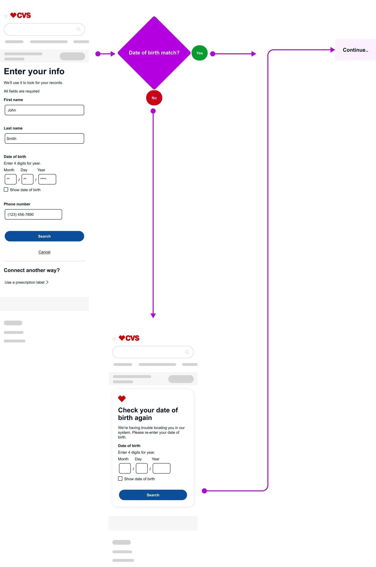
I simplified the experience by consolidating the flow into a single page with one dedicated date-of-birth field, making the entry clearer and easier to validate. This change reduced friction, helped users complete registration more quickly, and significantly lowered fallouts—without compromising security requirements.
“I’d be glad to walk through the rationale behind different success states during account creation.”
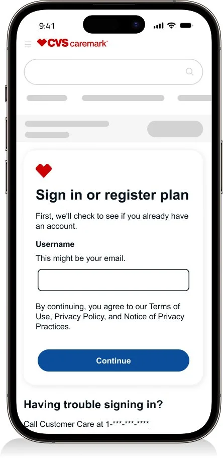
Caremark - Sign in & Registration
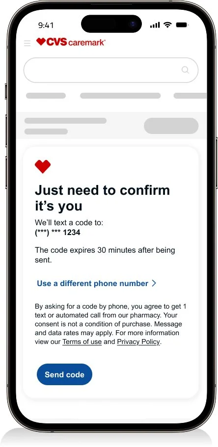
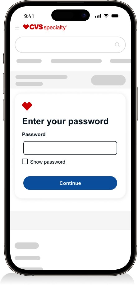
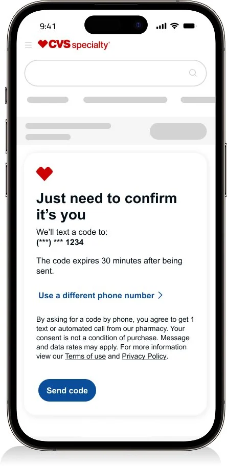
Sign in
Enter your username
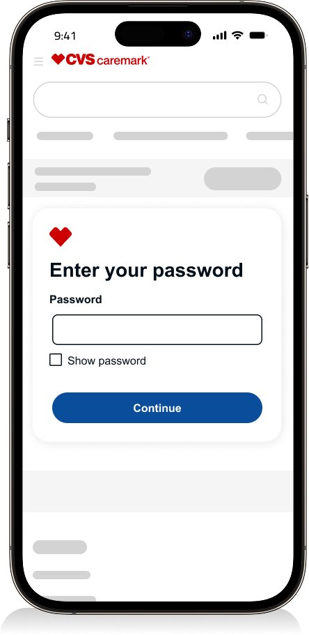
Enter your password
One time passcode
Create passkey
Created passkey and signed in
Results
Weekly traffic of 498K.
471.8K are successful making it a success rate of 88.29%


Registration
Enter your username
One time passcode
Create your account
Successfully registered
Results
Weekly traffic of 21.3K.
18.1K are successful making it a success rate of 84.99%

“I can walk through a registration concept designed to reduce fallouts when multiple accounts are associated with a single user.”
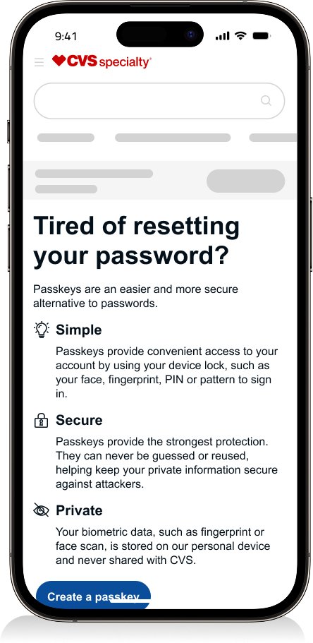
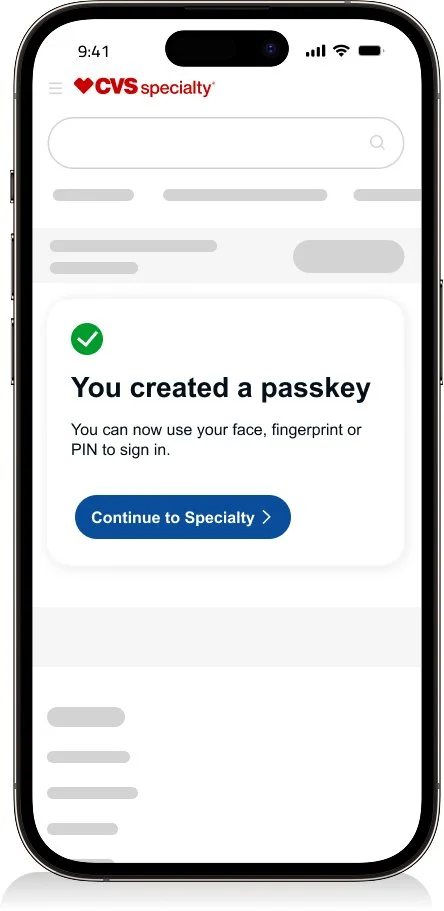
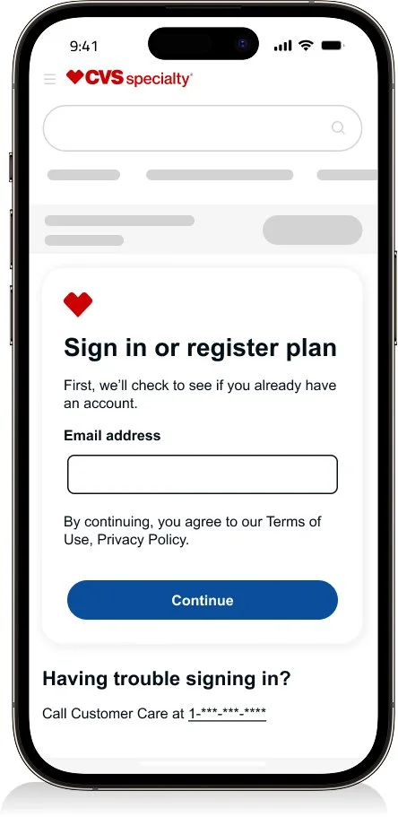
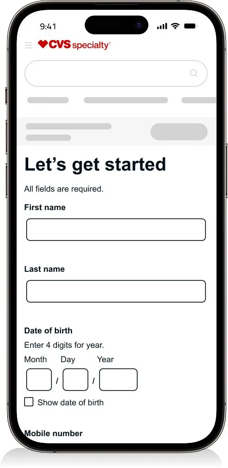
Specialty - Sign in & Registration
Sign in
Enter your username
Enter your password
One time passcode
Create passkey
Created passkey and signed in
Results
Weekly traffic of 311.1K.
311.1K are successful making it a success rate of 91.82%


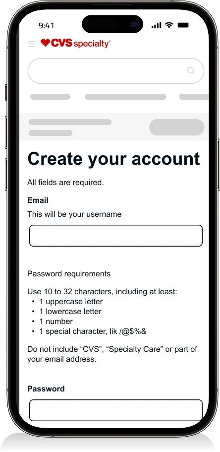
Registration
Enter your info
One time passcode
Create your account
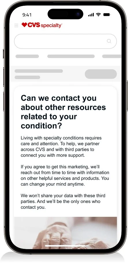
HIPPA Consent
Successfully registered
Results
Weekly traffic of 9.3K.
7.9K are successful making it a success rate of 84.93%


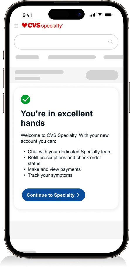
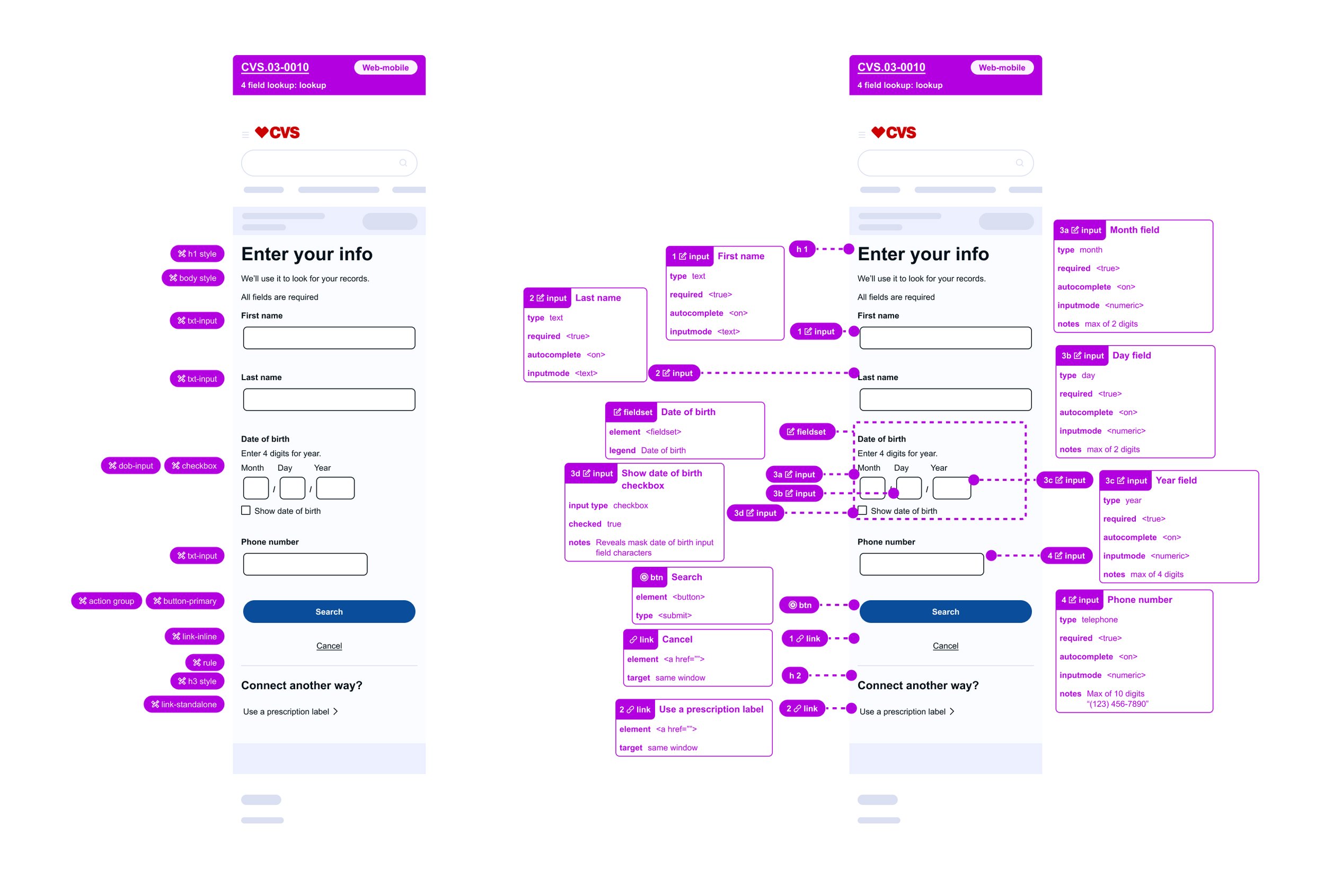
Dev hand off
Annotations
I prepare developer-ready designs with clear annotations to ensure engineers understand which components from the design system are being used and how they should behave. Accessibility guidance is embedded directly in the files, including semantic structure, action types, and input requirements such as required fields and keyboard behaviors.
This approach reduces ambiguity, supports accessibility standards, and helps teams build with confidence.
Full flow
Comprehensive user flows were created in collaboration with engineering and architecture to ensure end-to-end alignment. These flows documented key states and edge cases, retry attempts, and system nodes, supporting accurate and predictable implementation.

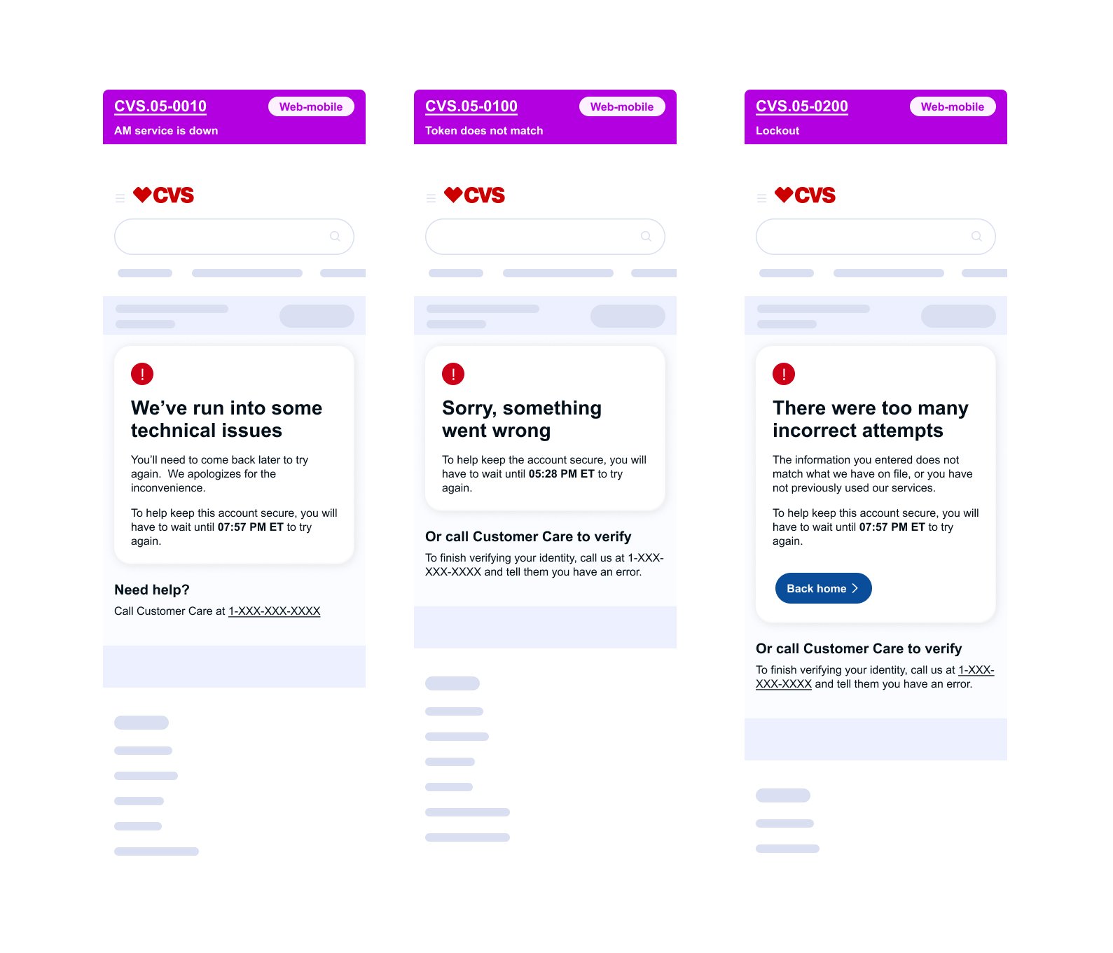
Error handling
Not every user journey follows a happy path. Designing effective error handling requires close collaboration with engineering to understand system limitations and potential failure states. While the goal is always to guide users toward the most helpful outcome, certain error conditions may limit available responses. In those cases, the focus shifts to reducing confusion and preventing frustration through clear, intentional feedback.
“I’d be glad to walk through how I annotate UI and provide a deeper look at the detailed flows across all three CVS family platforms.”